Project Description
Sector
Fin-tech (Financial Technology)
Company
PEAKS
My Role
UX Design/ Product Owner
Problem Description
This project was part of a change in mentality within my team. Where we previously mostly relied on clever slogans and cool visuals. Our team was now implementing a more data driver approach to get more customers in.
This ment a completely new way of building marketing campaigns, making designs decisions and collaborating with internal stakeholders.
Project Goal
To create a new visualisation of the product that can be used in the entire marketing funnel (ad’s, website and mobile app) so that the company gain more users in a more cost-effective manner.
Key performance indicators:
- Conversion to next step in the funnel
- Onboarding completion
- Cost per acquisition (CPA).
My process
This project is (by now) a few years old. The process displayed on this page does not fully represent my current workflow and is missing (what I now consider) essential steps. It is however still an interesting display of my earlier work and experience.


Discovery
In my discovery phase I spend time researching and understanding the problem I’m trying to solve while also exploring different ways of solving these problems.
Problem analysis
I started out by researching what obstacles potential new users might have and what kinds of reservations people might have. These topics were explored by:
- Collaborating with our customer care team and gather their insights on the experiences of new users.
- Conducting heat-map analyses on our own website to see what kinds of information people spend more time on.
- Interviewing both new users and people who have not yet become a customer.
- Analysing quantitative data from our marketing ads.


A method behind the madness
Previously, our team would create new ideas based on funny slogans, catchy phrases or discount promotions. But the results of these campaigns were wildly inconsistent and even when something was successful, we often didn’t understand why.
So for this project we started out with considering how we could adres the issues that our research had uncovered.
We ended up with grouping common issues on a whiteboard and then linking psychological methods of persuasion and explanation to those topics. And then making concepts around those ideas.
For these concepts we used methods like:
- Fear of missing out
- Social proof
- Sequencing
Concepting
In my concept phase, I gather all my findings from the previous phases, and condense them into a small number of concrete and flashed out concepts that can be tested and reviewed.
How it works..
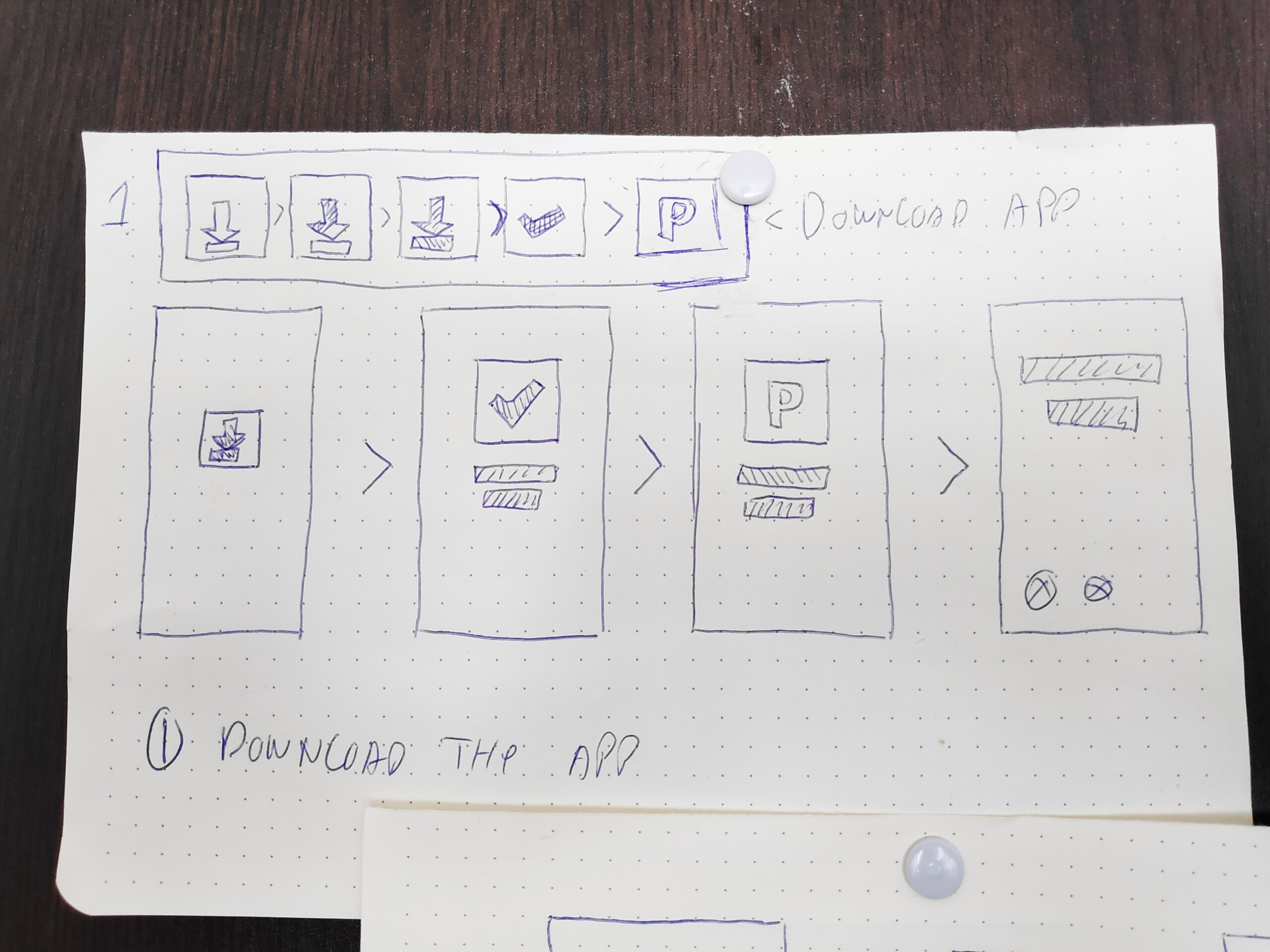
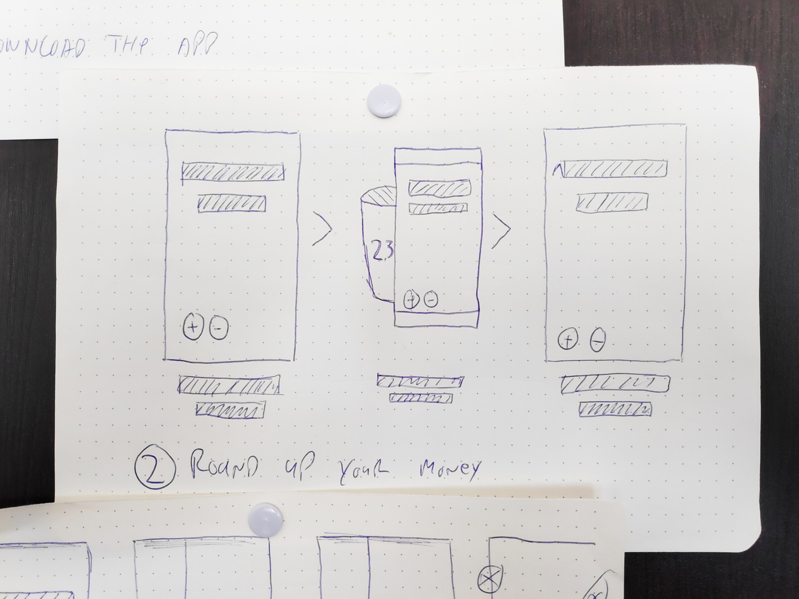
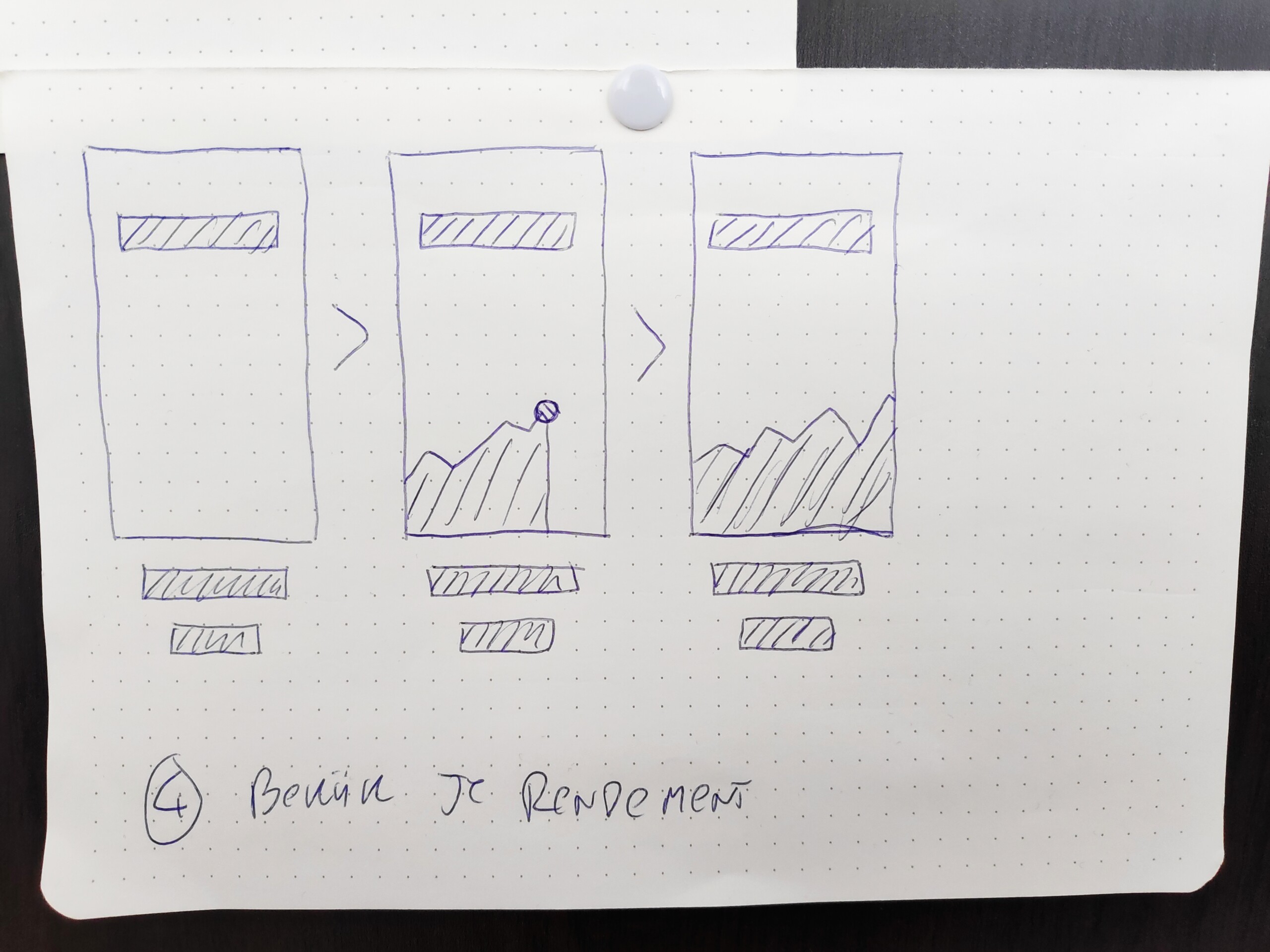
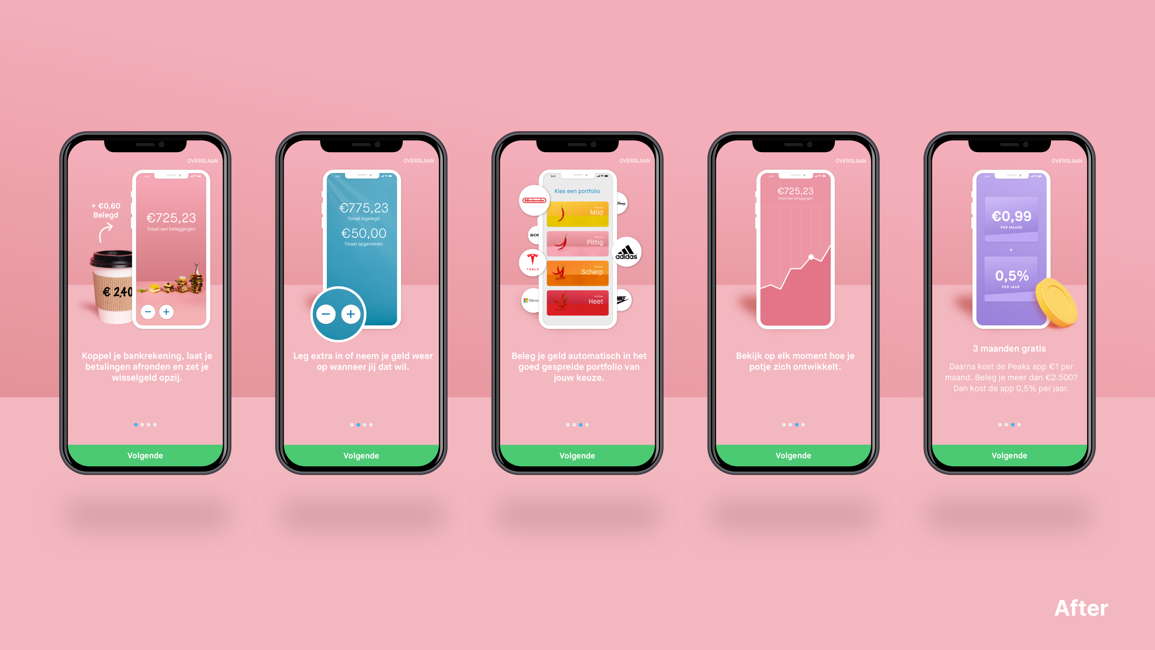
One of these concepts was called the “How Peaks works” campaign. Applying the sequencing technique to adres the problem that people did not quite know what to expect from the app.
The idea was to make a short introduction to explain how onboarding would work and convince the potential users that onboarding is actually not that big of a deal. This concept would be applied to marketing ads, landing pages and the onboarding process of the app.
This was one of five concepts that were chosen to be developed into full fleshed out marketing campaigns. For this case we keep our focus on this one as this turned out to be the winner (spoilers).

From concept to design
From quick sketches to animated designs, step by step these concepts started to take shape.
Sketching it out
I started out by sketching out the flows and screens.
Digitize sketches
After that, I started to make a first digital draft of some screens.
Iterate
Those evolved into more detailed, on-brand concepts.
Kill your darlings
With some ideas we had to let go of our first ideas and create better ones.
Bring it in motion
And to finish it all off, after we agreed on all the visuals. I animated certain elements.
Validation
In my validation phase, I test my concepts with users and internal stakeholders to make sure the solutions fit the need of the customer. This can be done with either qualitative or quantitative data (or a combination of both).

Comparing performance
In this case, we decided to run all concepts as ad campaigns at the same time. Comparing results to see what concept would get the most traction and generate the most users based on:
- Clicks on ads
- Leads to our website or appstores
- New customers generated by ad
- Average cost per acquisition
Scale-up with care
For this project, budget was an important factor, as our team needed to become more efficient fast. For this reason our team was rather risk avert.
To minimise our investment in unproven concept we started out with simpel ads per concept. Once a few of them gathered some traction, we scaled the concepts up with more variations, longer/high quality ads and in the end even landing pages on our website.
This ment that if something did not perform well we wasted very little resources and we were quickly able to scale up ideas that did work.

It is significantly easier to put an ad live than to
implement changes in a live application.
Delivery
And finally! The moment of delivery! After a long process of feedback, iterations and changes the project is finally concluded. This section is focussed on the end results of this project.
Website module
After our concept was validated I designed a module for our commercial website in line with the rest of the media output we made.
This solution was later validated with A/B tests to make sure it improved the overal performance of the website.
Advertisement & App store
The first step in the journey is the advertisement. This was made with an audience in mind that had never been in contact with Peaks before.
With a focus on a clean UI, clear separations between text and UI of the app, and the avoidance of complex terminology, this video was successfully implemented and performed really well.
(Do try it with sound if you speak Dutch or German)
Youtube ad
(Dutch)
Youtube ad
(German)
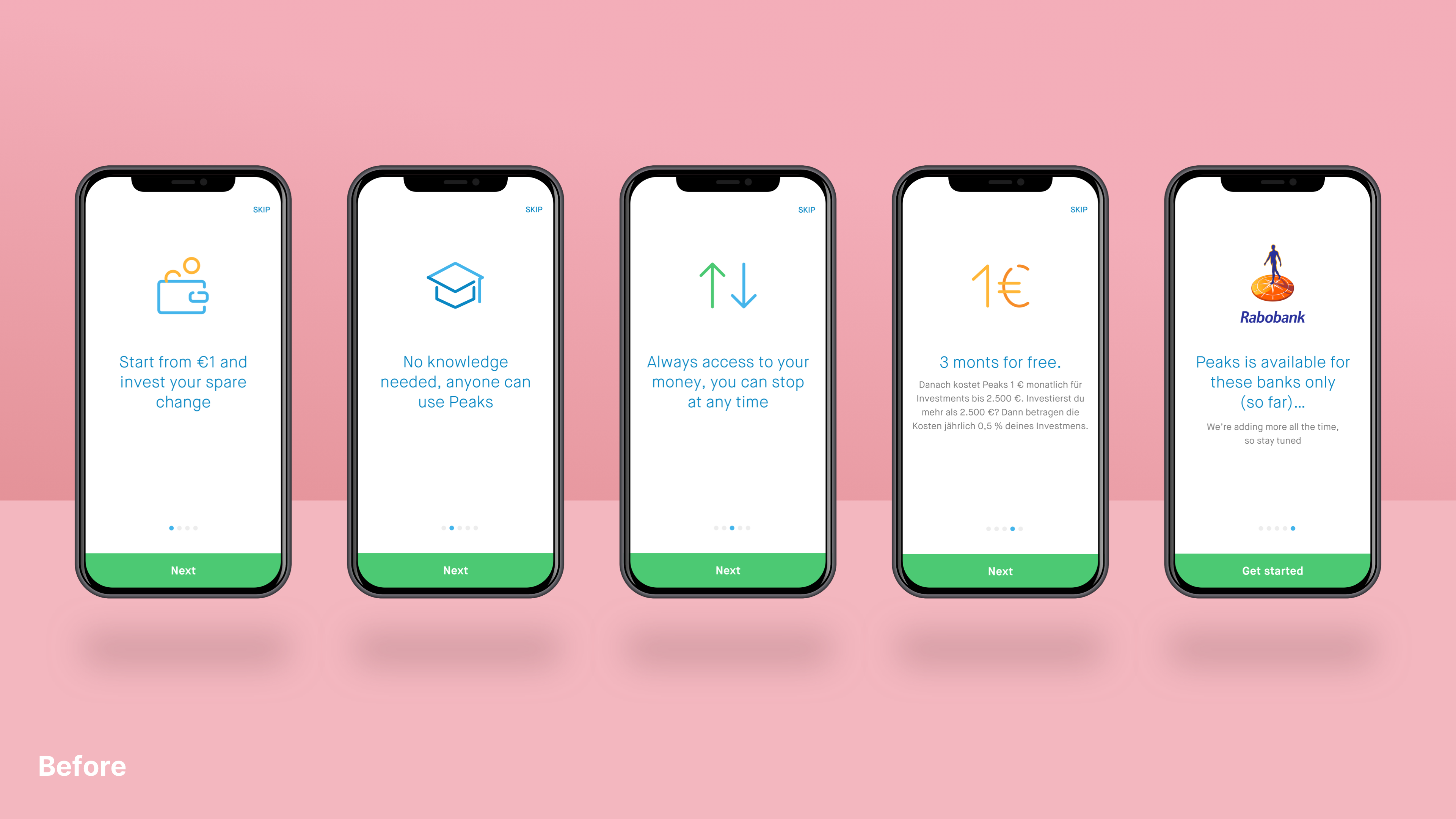
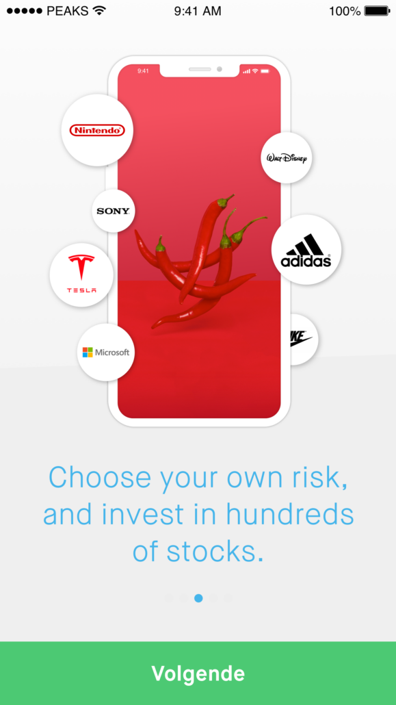
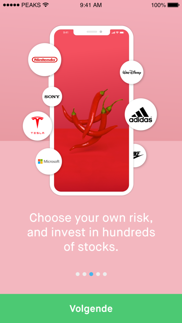
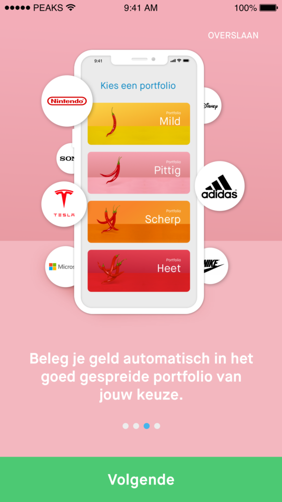
On-brand design
The first step of redesigning the so called “tour” screens of the app was to align the design with the rest of the brand and the app itself.
I started by applying the color gradients that are used in all other brand products of the company. After that I choose to step away from the icons that at that point were becoming outdated and replaced them with mockups of the app.
Build for the future
After the feeling of the app was fixed. I aligned with the stakeholders involved what their future expectations were for this part of the app. No use building something if it will be replaced within a year.
It turned out that the screens we designed for other parts of the funnel were also a perfect fit for the tour. By applying a simplified version of the app we were able to introduce users to the app without scaring them off or distracting them.