Project Description
Sector
Fin-tech (Financial Technology)
Company
PEAKS
My Role
UX Design/ Product Owner
Project Description
In 2019, Peaks was launching its product outside of the Netherlands for the first time. To boost the number of users on day one, we wanted to create a launch campaign that both generated interest in the product and spread the awareness of its existing.
It was my task to design an online waiting list campaign with a viral effect to gather as much leads as possible. This involved interviewing German citizens, user testing the flows and a lot of iterations.
However, launching a financial product in another country did not come without its challenges. We faced a completely different financial culture and skepticism from the beginning.
Project Goal
To create a waiting list campaign that will generate a group of leads to boost the launch in Germany.
Key performance indicators:
- Number of sing-ups
- Number of people onboarding on launch
- Percentage (%) of sing-ups to onboarded users
My process
This project is (by now) a few years old. The process displayed on this page does not fully represent my current workflow and is missing (what I now consider) essential steps. It is however still an interesting display of my earlier work and experience.
Find out what the user cares about
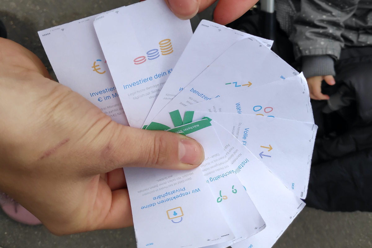
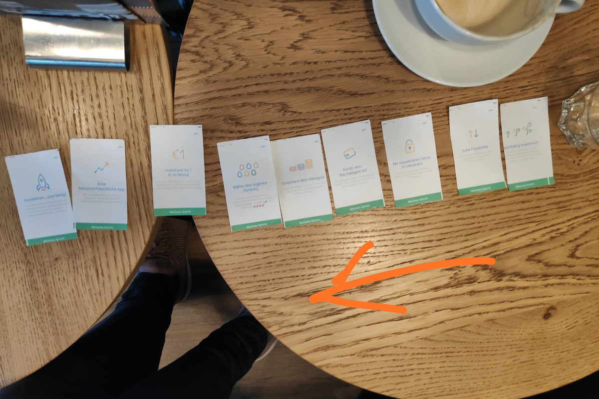
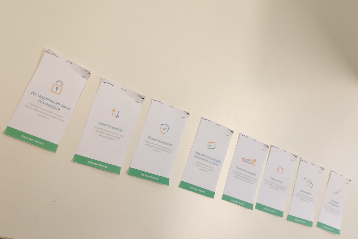
During this project I was fortunate enough to be able to travel to Germany several times. The first round of research was about finding out what priorities the average German consumer had. And experience the German financial culture our selves. To test what USP’s would be most appealing in Germany, we made a deck of cards with a mockup of each USP as it would be displayed in the app, and ask people to order them.
Empathy Mapping
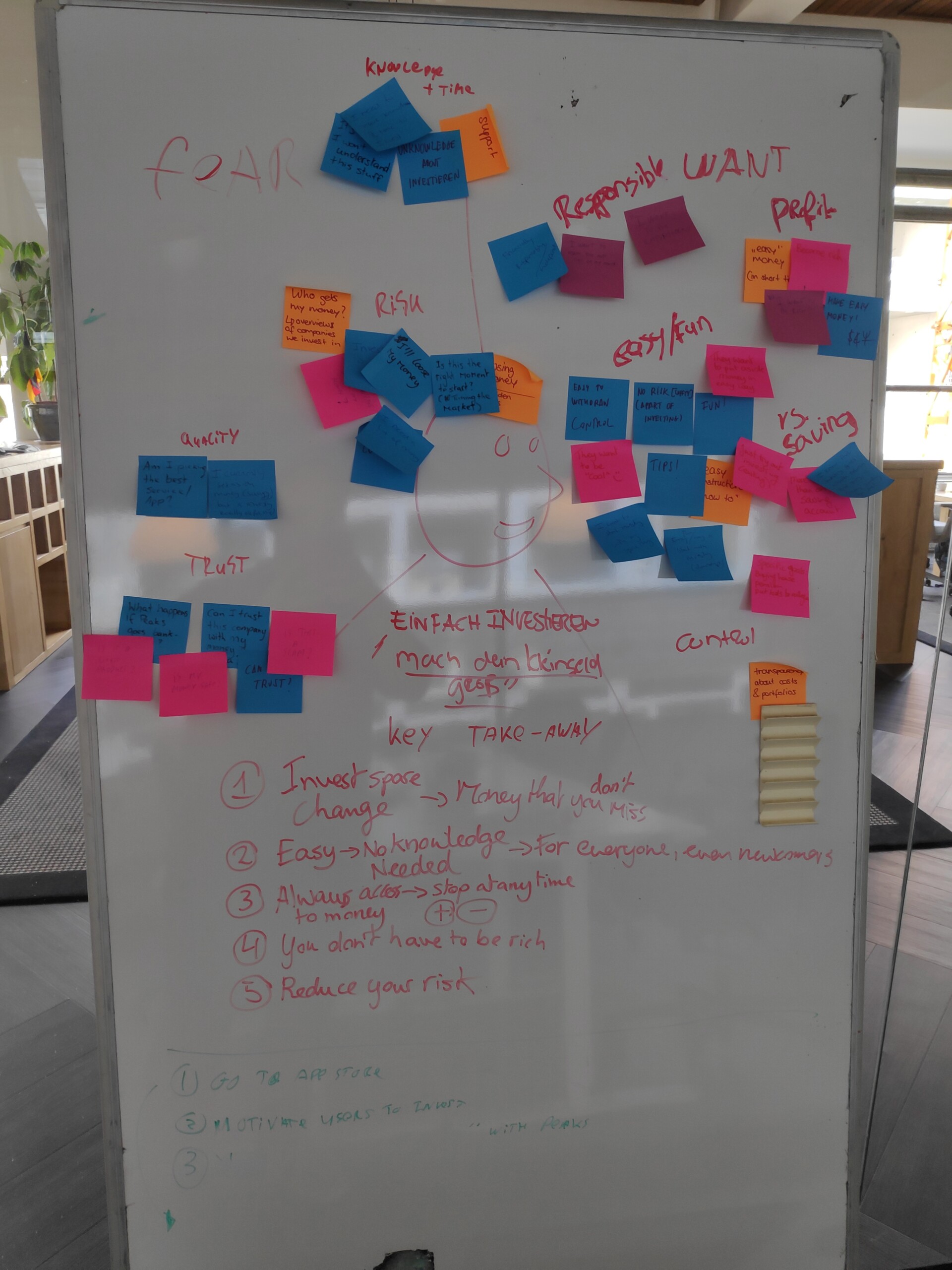
Based on the findings of the card sorting sessions and interviews we held in Germany, we sat together and mapped out the general priorities of the project. The most important decisions of this session were to decide what pages on the website would be needed, which should get priority and what content should be different from the Dutch website at the time.
Our findings were that:
- The round-up feature of Peaks was the main selling point in Germany.
- Of all USP’s, it being easy was the most appealing to the users.
- Always having acces to your money was also an important USP.
- A lot of participants assumed you needed to have a lot of money to get started, which wasn’t the case.
- Risk and security turned out to be big topics in Germany, more so than in The Netherlands.
Sketching
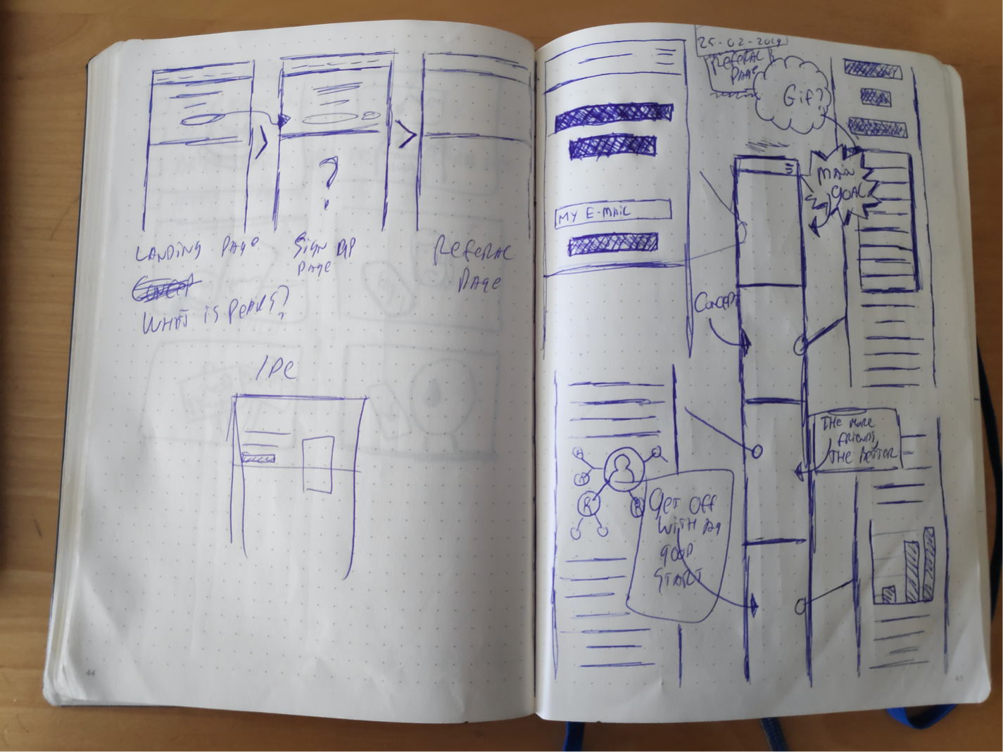
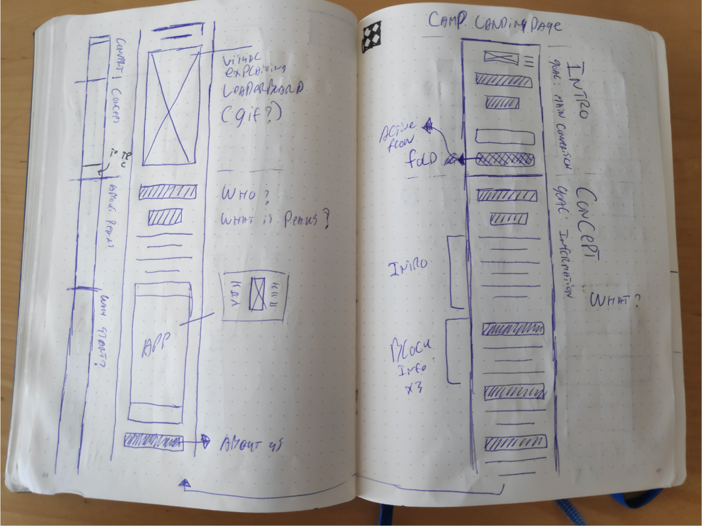
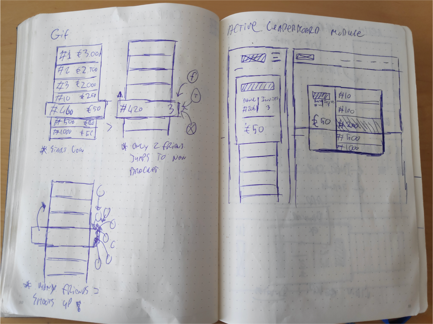
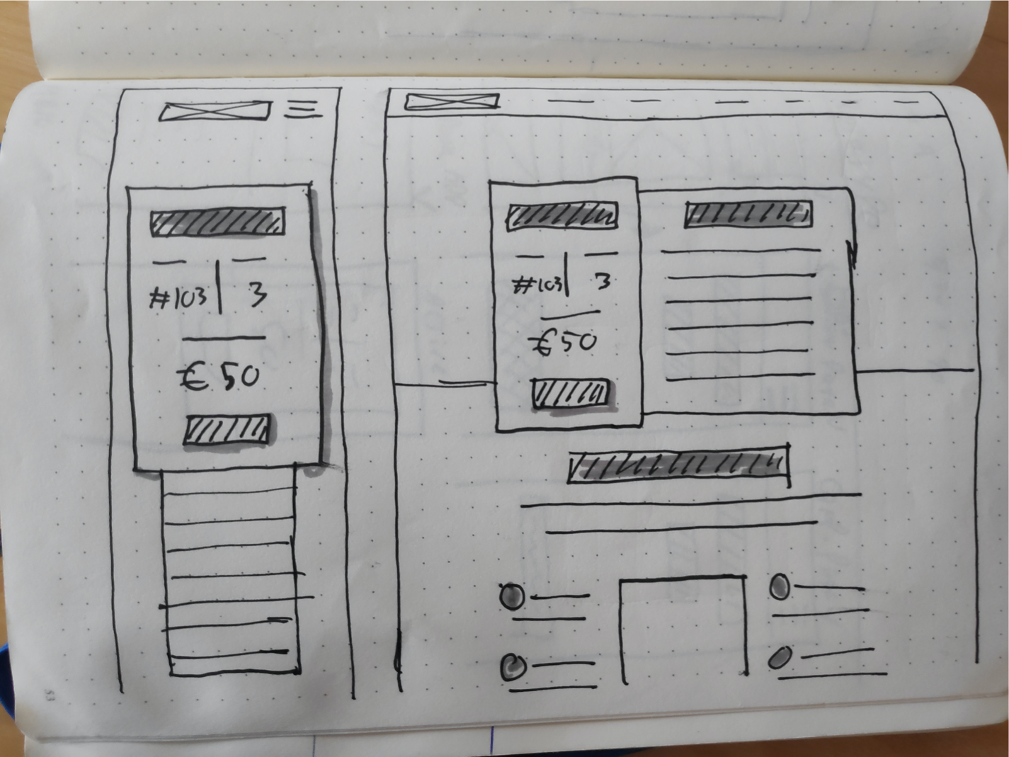
In my design process I prefer to start early on with sketching out my ideas. This is a quick way of visualizing my ideas and also helps to get feedback early on without having to spend too much time on designs that inevitably will have to change later on.
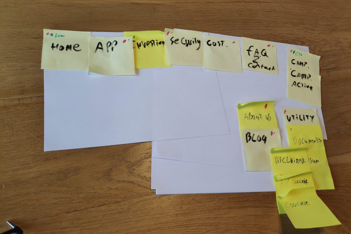
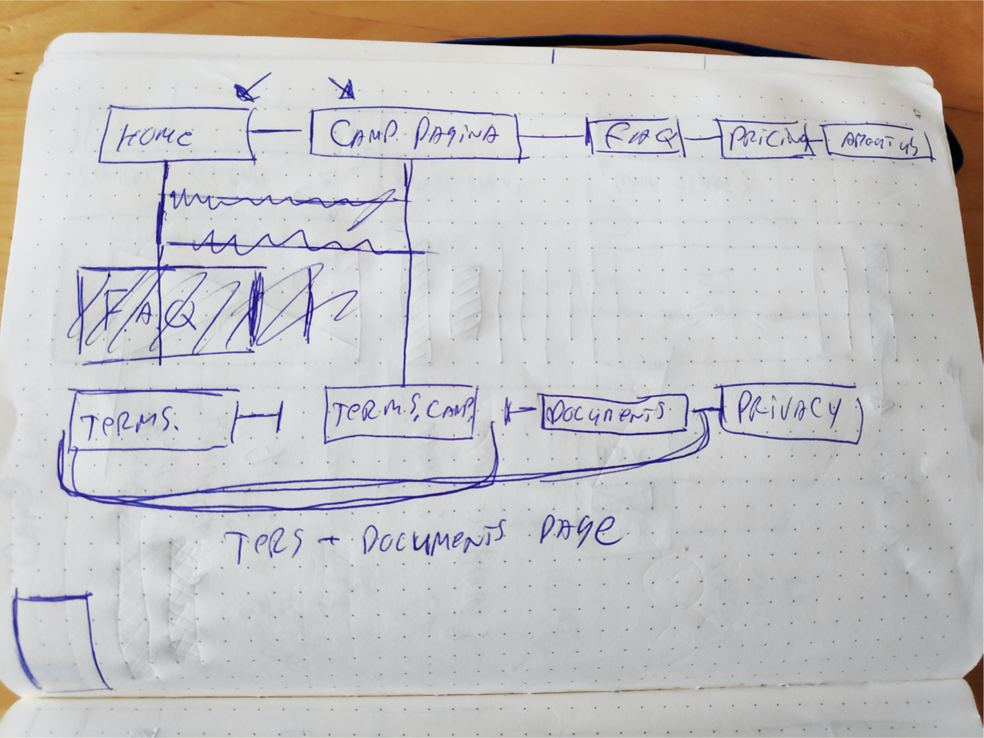
Site mapping
And so, as a conclusion of the session we mapped out the high level content of the website. There were some additional pages needed plus a specific launch campaign page.
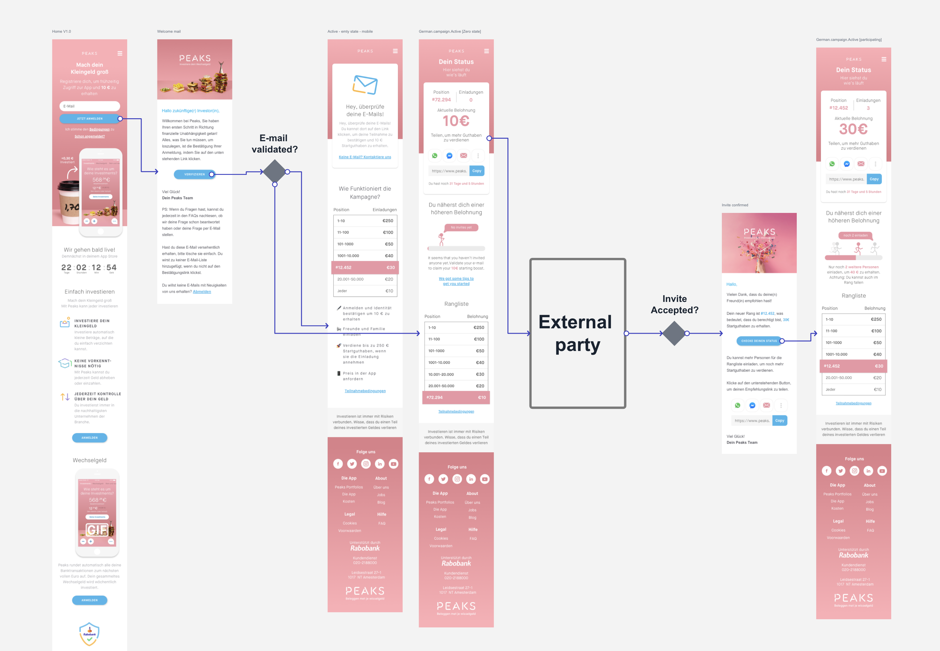
Designing a new landing page
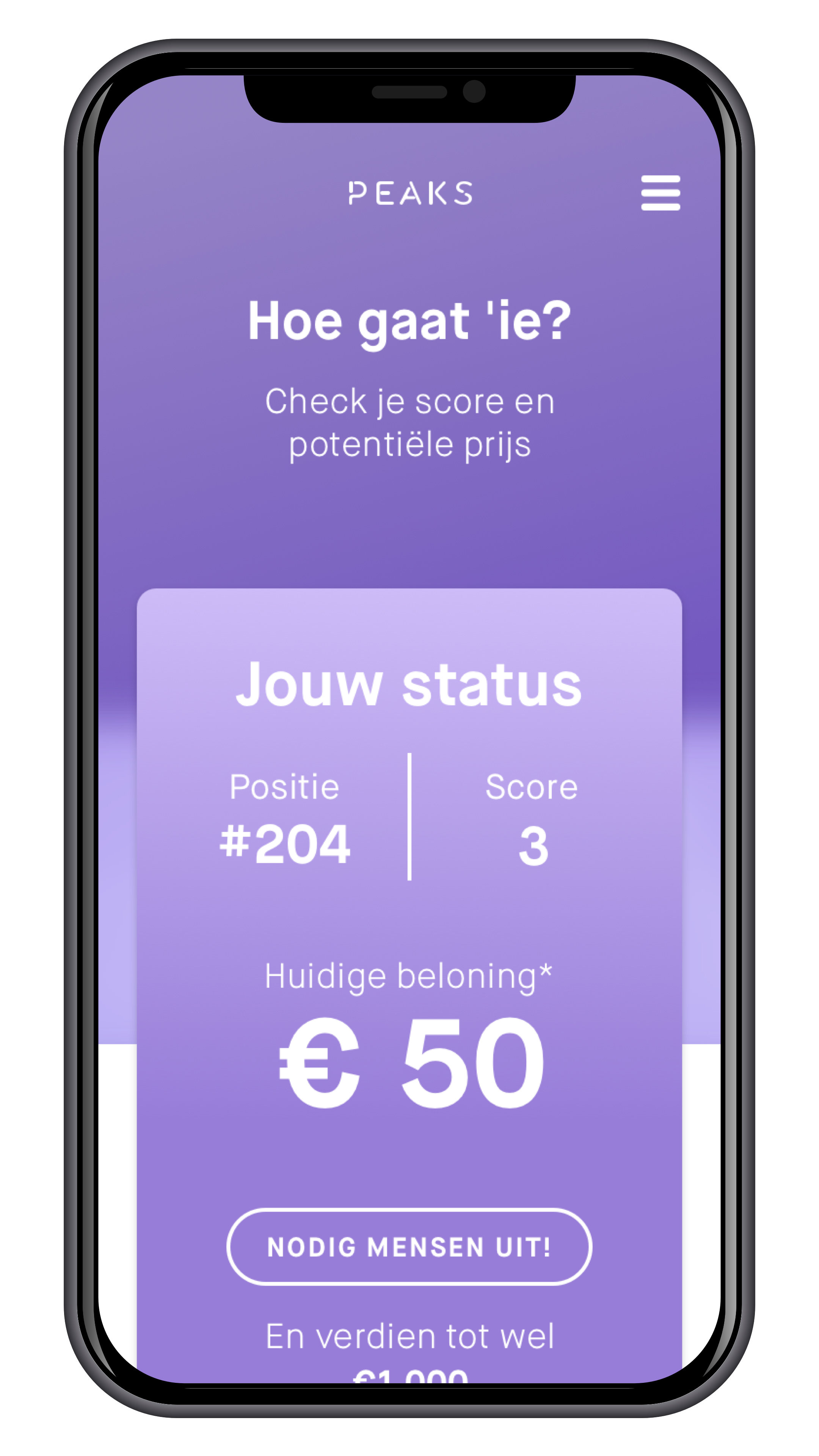
Attempt to put everything above the fold.
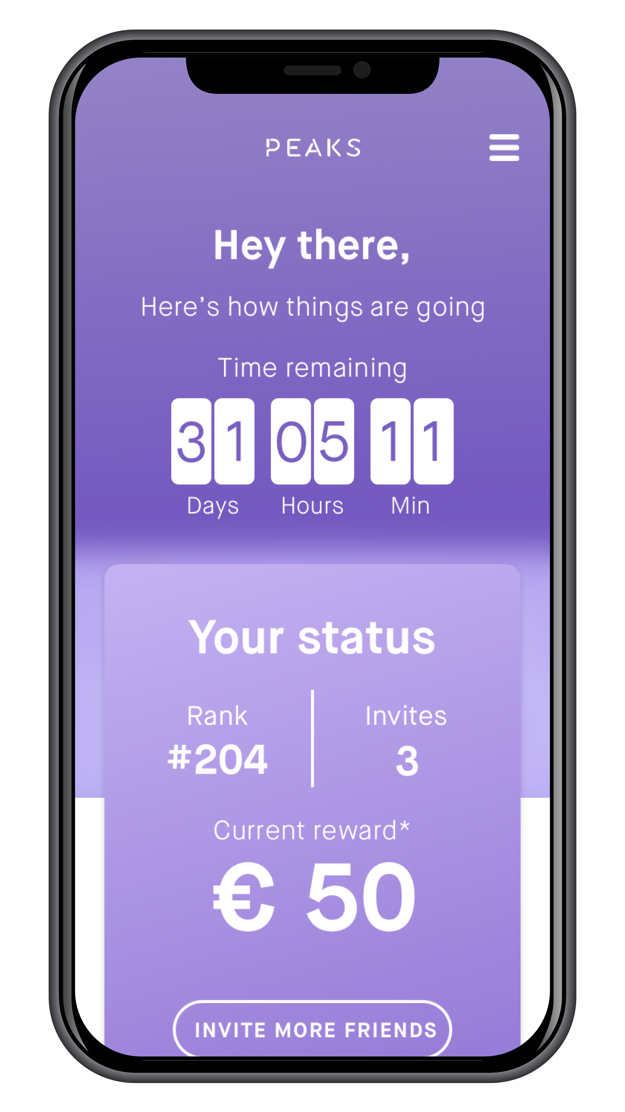
Adding a countdown to create urgency
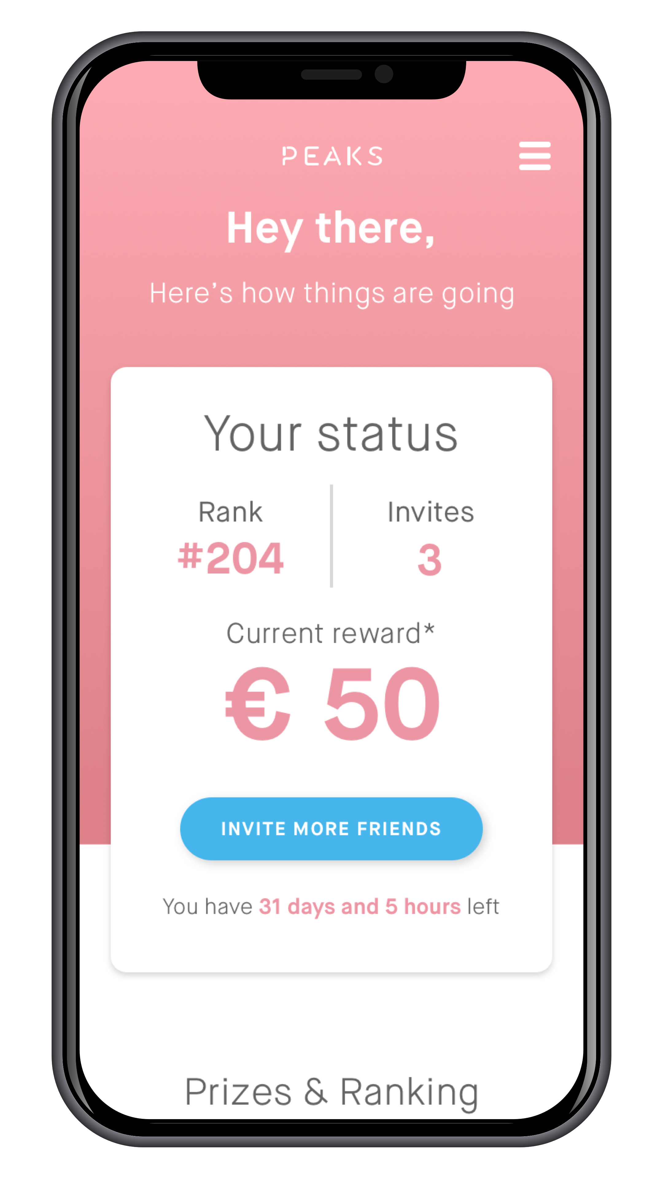
Switching to a more on-brand look
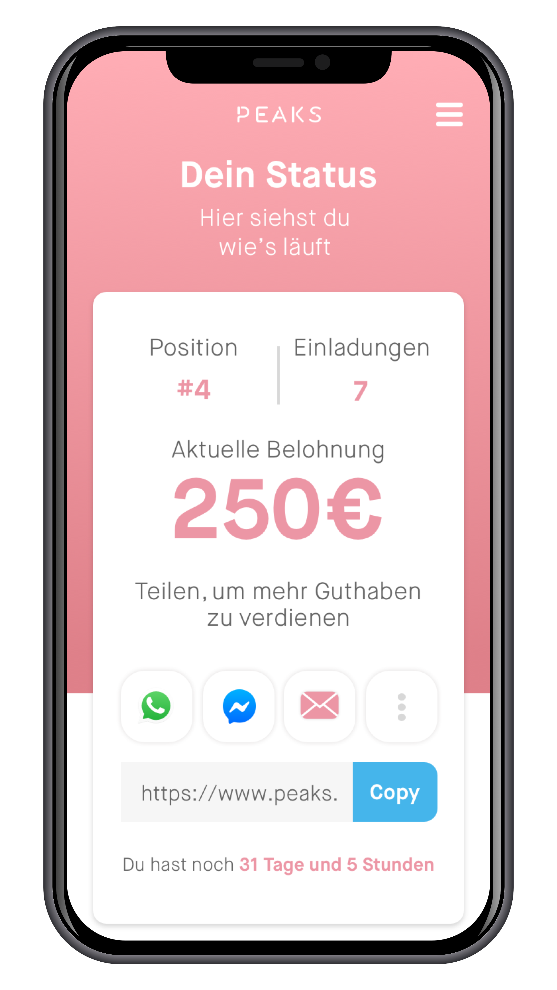
Adding social sharing buttons in the first element
Prototyping
When our field research was done, and our concepts were drawn out. It was time to put our concept to the test!
A real audience
Our field research showed us that the financial culture in Germany was notably different from The Netherlands. This ment that in order to get valuable results, we needed to cross the border…
Three rounds of testing
As usual, our prototyping exited out of 3 rounds of testing, with a few weeks in-between for iterations. Our first round was executed in our own office in Amsterdam with German citizens living in Amsterdam to get the first impressions. Knowing this was not an accurate representation of the German population we planned two more trips to Düsseldorf and Frankfurt.

First impressions matter!
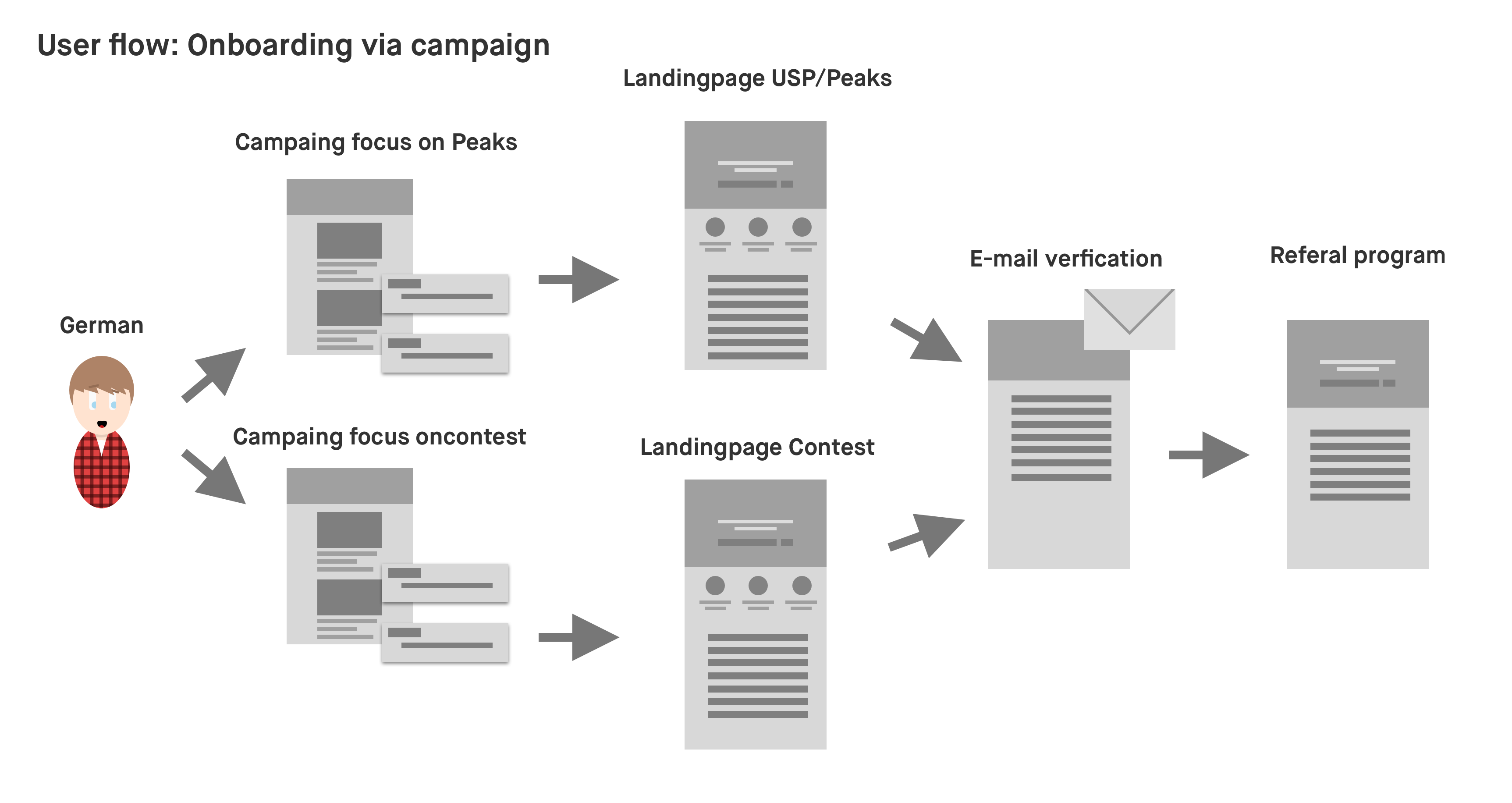
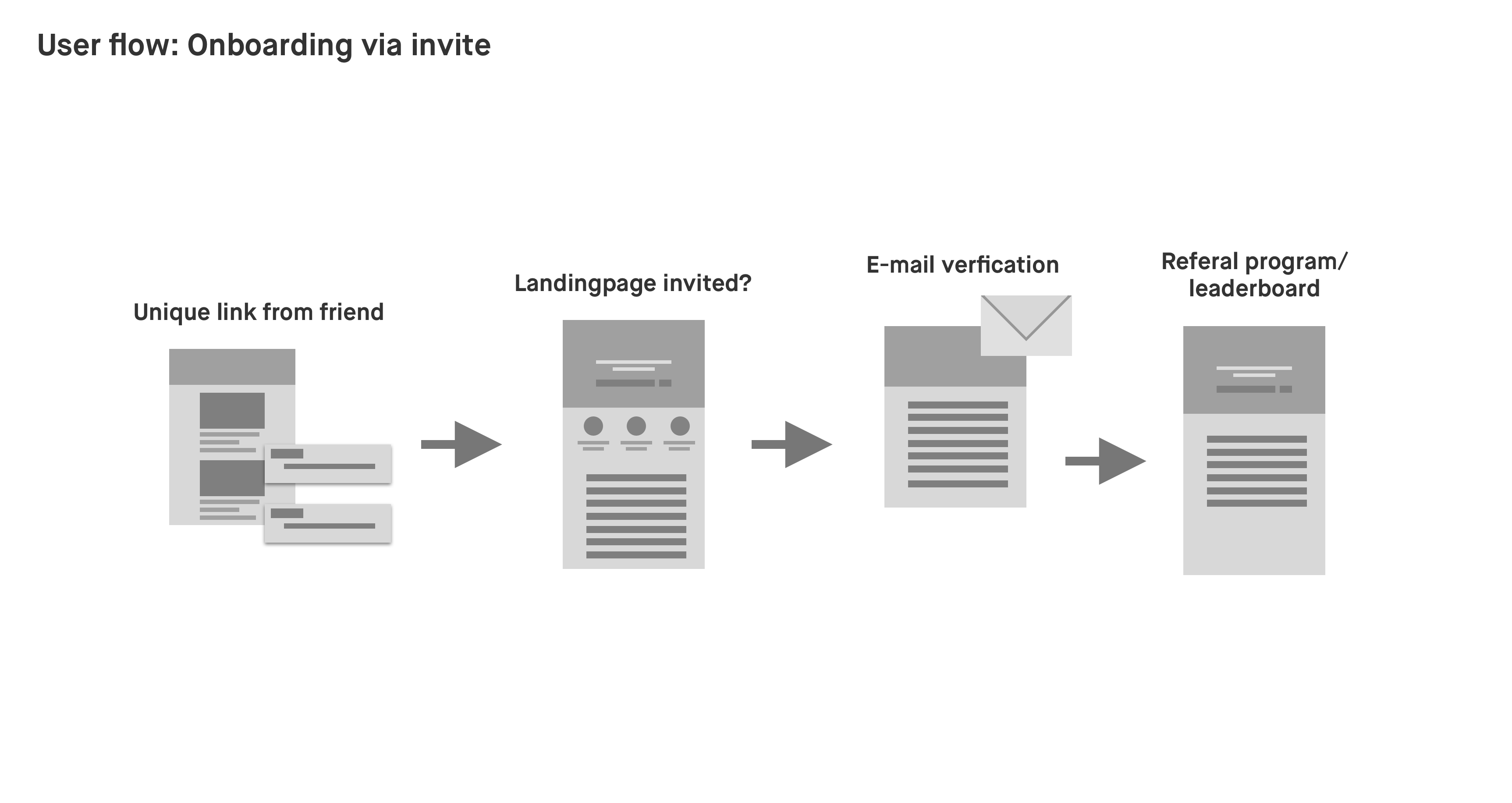
We tested variations of the user flows show before. And were mostly focussed on how people reacted to the brand and the product. What their first thought were and their doubts. What was already clear to them? And what was not?
But why?
What we hoped to get out of these rounds of testing were confirmations or disprovals of our assumptions as well as seeing responses from people representing the main target audience. We used these insights to improve not only the launch campaign, but also our general messaging in Germany.
Findings
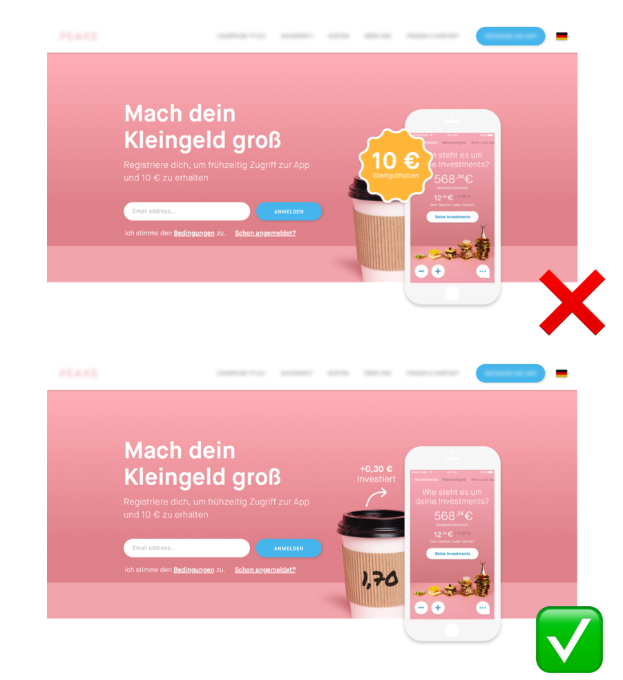
Core product over campaign
Do we attract people with our product? Or do we get attention with monetary rewards? That was one of our first considerations that should be tested. We assumed that users would be more inclined to join if they had a little incentive. But it turned out that for most people, the product itself was way more important.
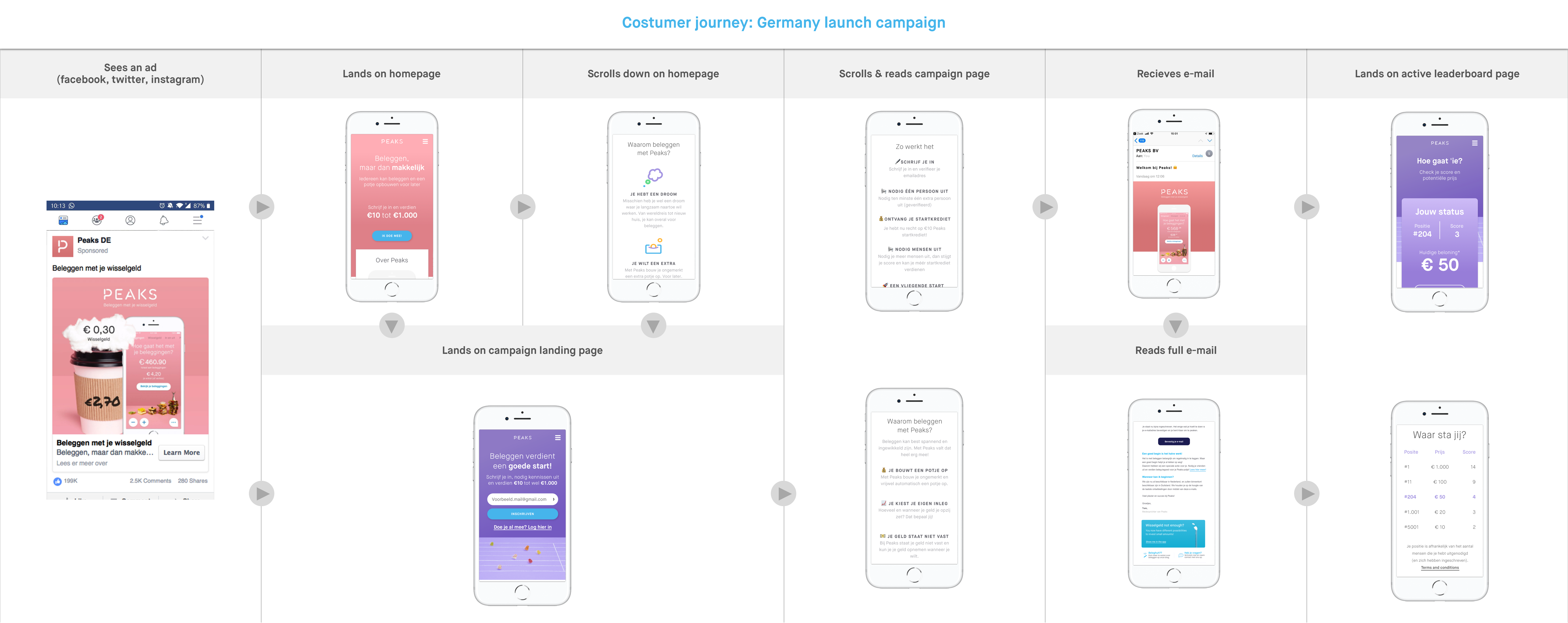
This resulted in a change in tone for the marketing, focusing it more on the product. We also decided to change the customer journey to go first to our homepage, that was focussed on the product, before sending people to the dedicated campaign page that was focused more on the short term reward.
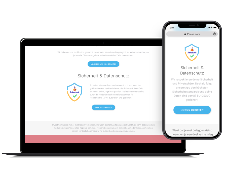
Security is a game changer
You would assume that being a Dutch company would give you some credit in a country like Germany. But think again. Because it turned out that out of the 15 people we first questioned on the subject, 12 admitted to feel more compelled to consider the product if we were able to explain, in detail, how we deal with data security and privacy. Which was a lot less of an issue in The Netherlands.
Sharing behavior
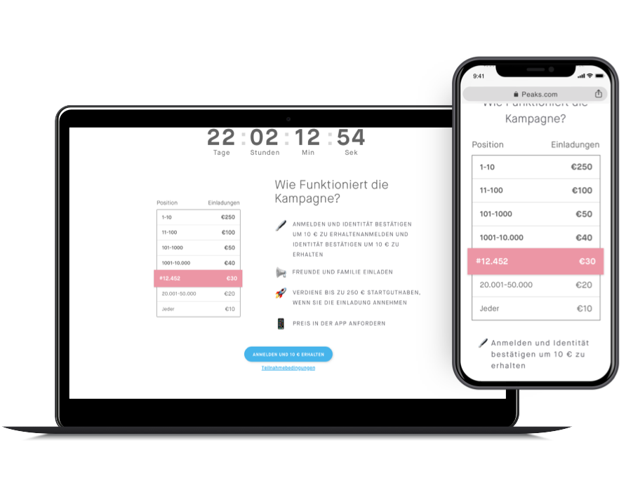
The concept of creating a viral campaign to boost our download numbers was a “borrowed” from similar products in the USA. However, it later turned out that people in Europe, and especially Germany people tend to be less active in these kinds of campaigns. Statements like “I don’t want to endorse a product that I haven’t used yet myself” or “I don’t want to look like a fool if the product turns out to be bad” were pretty common.
This ment that we needed to put extra effort into convincing users who signed up that the product was solid and get them hyped.
The final Journey
