Project Description
Fredhopper Insights redesign
In 2021 I started as a product designer at Attraqt. After a few months I was assigned to the redesign of the Insights feature of their Fredhopper product (a SAAS search optimisation platform).
This feature was being used by some big names in the e-commerce industry and had become both visually and technically outdated. My task was to use my skills as a product designer to make a redesign of the platform by performing UX Research, hosting workshops with the teams involved, designing and testing new ideas and delivering a platform that could be used for years to come.
Role:
Product Designer
Tools used:

Figma
Client/employer:
Attraqt
My process
This project has recently been delivered internally and is a great example of my current workflow. If any part interests you specifically, feel free to skip ahead!


Fredhopper Insights redesign
In 2021 I started as a product designer at Attraqt. After a few months I was assigned to the redesign of the Insights feature of their Fredhopper product (a SAAS search optimisation platform).
This feature was being used by some big names in the e-commerce industry and had become both visually and technically outdated. My task was to use my skills as a product designer to make a redesign of the platform by performing UX Research, hosting workshops with the teams involved, designing and testing new ideas and delivering a platform that could be used for years to come.
Role:
Product Designer
Tools used:
Client/employer:
Attraqt
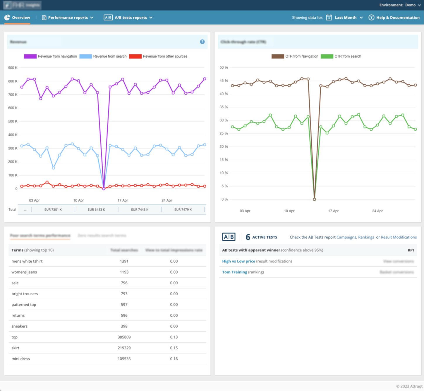
Image (some elements blurred out) of the legacy product.
Project briefing
Project goals
The main goals of the project was to research how we can provide more value to our users within the insights tool, with a visual update to top it all off.
Problem statement
The project was given birth on the foundation of 3 reasons. This project was a stark reminder how important deep-diving into the cause of a project can be (more on this later). Those three main problems were:
- The design had not changes in over a decade, even though it was a supportive feature to a larger product that had recently received a visual upgrade.
- We had received complains from large customers about a lack of features and reports that the tool was barely being used.
- The platform had been build on now outdated technology, making it impossible to add new features. Therefore it needed to be rebuild from the ground up.
My impact
My role within this project was to be responsible for the overal user experience. I was to research the needs of the users, host workshop with stakeholders within the company and design (and test) a solution.
Taking inventory
Internal alignment
For this project I would work with multiple internal teams and stakeholders, therefore it was important to make sure all parties involved were considered, informed and consulted before the project started out in earnest.
Taking inventory is a new phase that I’ve added to my design process after some learnings in the past. It involves meeting with multiple teams and stakeholders to align on:
- Project history: Does the project already have a history? Has some work already been done on it and do we already have some data available?
- Alignment on intent: Does every team want the same thing out of this project? What is our succes criteria?
- Gathering insights: Talking with people from different teams and professions adds new insights to the projects and helps break biasses.
Challenging biases
It turns out that when you talk to a verity of people, you get some new and conflicting information on the project. This helped us identifying misalignments and misconceptions early on that would have cost us a lot more effort later on. Some examples of these were:
- The technical team was mainly focused on making the back-end more efficient while the sales and management teams were looking for new features to sell. This challenged the original project goal (the “why?” of the project).
- A lot of technical limitation that were provided early on were challenged and overcome.
- The amount of active users turned out to be so low, that we did not have to consider maintaining any form of precedence.
These kinds of findings helped me to get started on this project.
Discovery
In my discovery phase I spend time researching and understanding the problem I’m trying to solve while also exploring different ways of solving these problems.
Customer interviews
Research goals
The research that I conducted for this project was ment to give us a better understanding of the need of our users. So we could use this information to design features that could provide value to our users (and sell more subscriptions).
Applied methods
The research was however not only customer facing. The research also included what I like to call “Doing inventory” which includes having internal discussions about what knowledge already exist within the company and checking how much decisions have already been made based on assumptions. The rest of the research consisted out of:
- Customer interviews – including general feedback and on topic questions.
- Card sorting sessions – Prioritising the needs of the users.
- Usability testing – Discover how users are using the tool now.
- Benchmarking – See what the industry standards are, how other products deal with these challenges.


Research findings
What we found was a user base that was a lot less experienced with data than we initially anticipated. We also discovered that the platform was barely being used, even by the people we expected to be active users. Main reasons for this turned out to be:
- Data that was shown was very simple and not enough to give valuable insights.
- A lot of data shown was not “actionable” meaning that our users were unable to make decisions based on the data we presented.
- Our insights and management platform were completely separated for each other, providing no benefits for our user to use it over 3rd party options.
Workshop with the team
Collaboration is an important part of my design process and in this case going through our findings with the team helped us gathering ideas on how to solve them. But also what pain points should be prioritised.
- We concluded that there was no easy workflow between the management and insights platform.
- Users were shown a lot of information but had a hard time understanding what data was important and what kinds of decisions should be made based on it.
- A lot of our metrics had similar naming conventions as big platforms like Google, but a lot of the calculations were made differently. Resulting in users not trusting our data because it was inconsistent with other platforms.

Customer journey mapped out by the team
Concepting
In my concept phase, I gathered all my findings from the previous phases, and condense them into concrete and flashed out concepts that can be tested and reviewed.
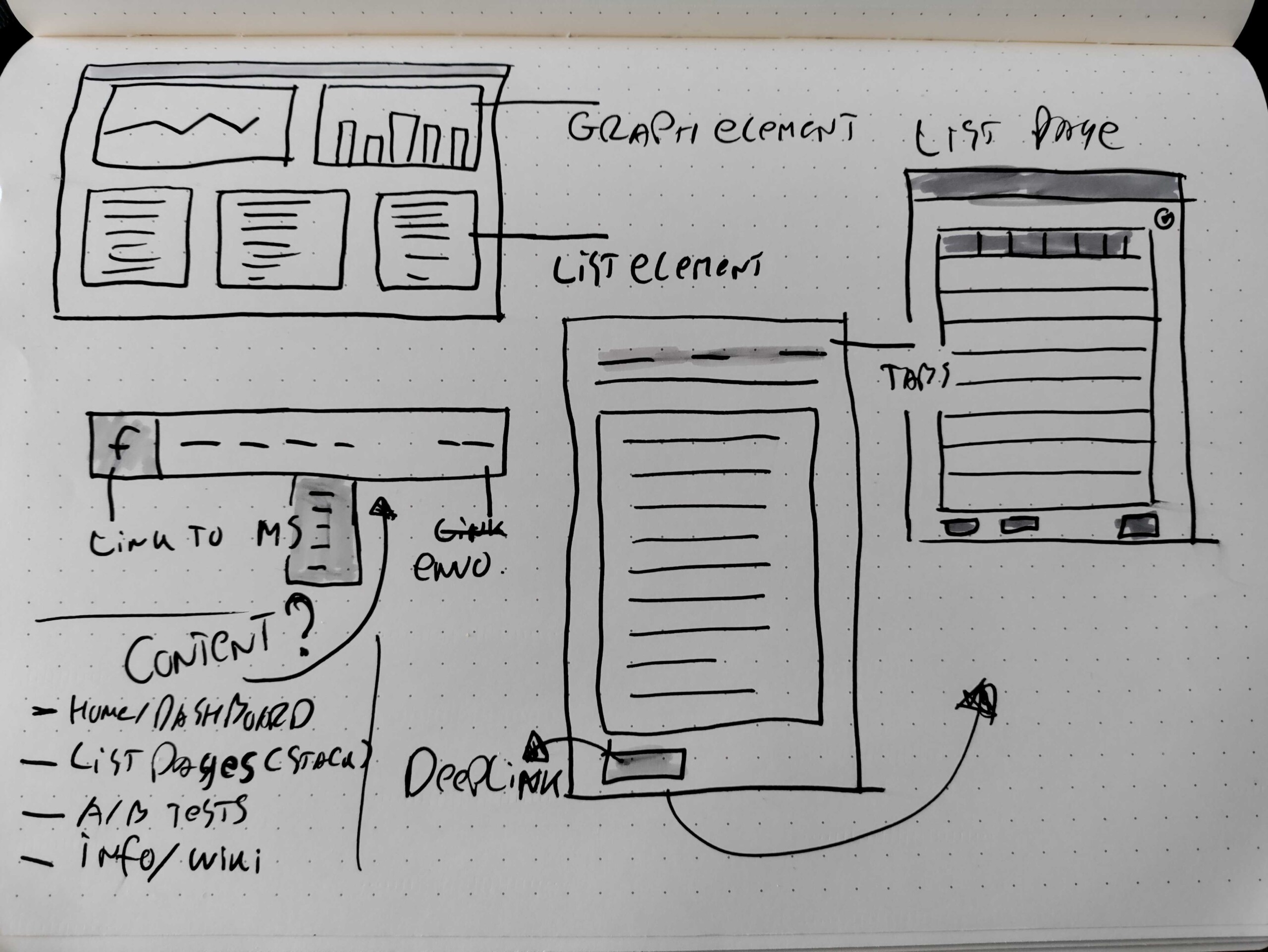
Sketching out ideas
I’m a big fan of drawing out ideas first. It’s an easy way to visualise my first ideas, identify design challenges and communicate my frist ideas with my colleagues.
It’s even more fun when other colleagues (especially non-designers) join in with their own ideas.

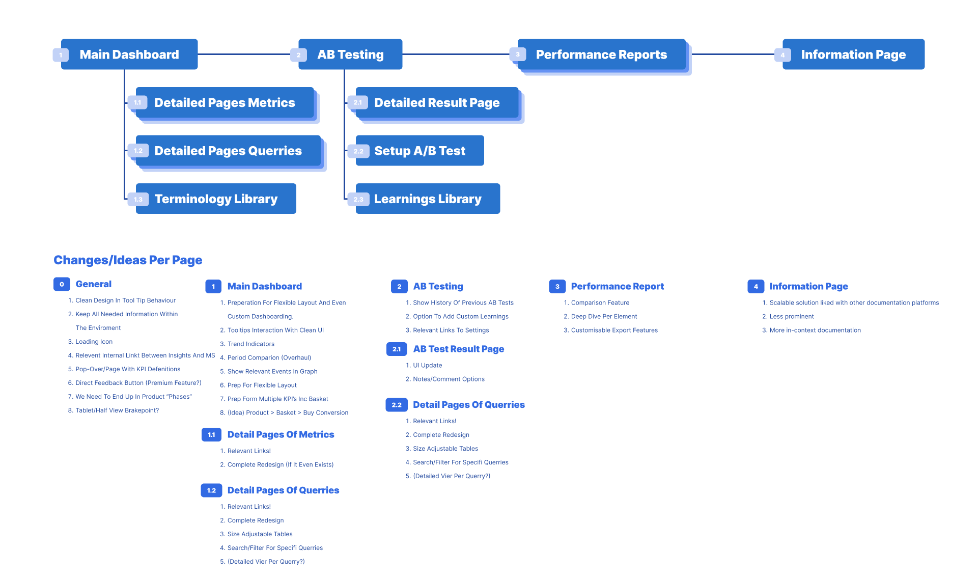
Information architecture
Part of setting up the first concept was drawing out the overal structure of the platform this ment deciding what information would be presented where. What new features would/could be useful and how pages should be structured.
This was also a good place to sort out all new ideas that we gathered in the previous phase and sort them out over pages and features.
First digital designs
After many sketches and meeting I started with the first digital designs for the product. Applying the style guide of the general product, sketching out and wire-framing what elements should be where.
It’s always funny to look back at the first designs and see how much has changed in the end. But you need to start somewhere.

Customer journey mapped out by the team
Design through iterations
After the first design we went trough numerous feedback sessions. Every round, we starte to pay more attention to the details

Component library
Once the general design was agreed upon I started on building the supporting component library for the platform. This ment:
- Setting up token values for all elements and testing the consistency of colour application.
- Aligning all naming conventions with the development team.
- Building all component scalable and according to the “atomic design” principals.
Designs systems are complicated topics, and I’ve lead a large project on design system standards within this company that I’ve made a dedicated case study about!
Responsive template
To my surprise, a lot of B2B SAAS (business to business Software as a service) products aren’t designed responsive by default. The rational behind this is that these complicated tools will only be used on desktop.
However, our research has shown that after 2020, the way people interacted with their laptop has changed. Because people worked from home now, they used smaller screens and often split their screens.
Because of this, we concluded that the redesign should support flexible layout designs.
Validation
The validation phase is all about validating assumptions made earlier during the process. This is usually done by testing design with users but also by doing internal technical en usability reviews.
Prototyping interactions
Using Figma’s prototyping tools, I started out by prototyping the most common interactions of each mayor page and combining them into our first prototype. This prototype was then shown to:
- Potential users
- Internal stakeholders
- Developers
- Customer facing colleagues.
Example: improvements turned out to be a more complex calculation that required a tooltip.
Testing technical limitations
The prototype was not only testing usability though. It also visualised certain interactions and features to the development teams, providing them with a better idea of what was being asked of them.
This resulted in some feedback that added extra complexity to the product that required some small redesigns.
Looking (and adapting) for those edge cases
Besides testing if the new design would fit the users needs (of which we already had a pretty good idea) these tests also helped us identify smaller use-cases that we did not consider at the beginning. Some of these cases were:
- Users wanting to interact with numbers in rows instead of having the full rows opening a detailed report.
- People wanting more information up front before entering full reports.
- Users requiring a dedicated “refresh” button (instead of using the browser one).
These are just a few of a long list of small use cases we encountered.

Example: Adding checkboxes instead of making the whole row clickable lets users select individual numbers of each row.
Image (some elements blurred out) of the legacy product.
Project description
Project goals
The main goals of the project was to research how we can provide more value to our users within the insights tool, with a visual update to top it all off.
Problem statement
The project was given birth on the foundation of 3 reasons. This project was a stark reminder how important deep-diving into the cause of a project can be (more on this later). Those three main problems were:
- The design had not changes in over a decade, even though it was a supportive feature to a larger product that had recently received a visual upgrade.
- We had received complains from large customers about a lack of features and reports that the tool was barely being used.
- The platform had been build on now outdated technology, making it impossible to add new features. Therefore it needed to be rebuild from the ground up.
My impact
My role within this project was to be responsible for the overal user experience. I was to research the needs of the users, host workshop with stakeholders within the company and design (and test) a solution.
Research
Research goals
The research that I conducted for this project was ment to give us a better understanding of the need of our users. So we could use this information to design features that could provide value to our users (and sell more subscriptions).
Applied methods
The research was however not only customer facing. The research also included what I like to call “Doing inventory” which includes having internal discussions about what knowledge already exist within the company and checking how much decisions have already been made based on assumptions. The rest of the research consisted out of:
- Customer interviews – including general feedback and on topic questions.
- Card sorting sessions – Prioritising the needs of the users.
- Usability testing – Discover how users are using the tool now.
- Benchmarking – See what the industry standards are, how other products deal with these challenges.
Findings
What we found was a user base that was a lot less experienced with data than we initially anticipated. We also discovered that the platform was barely being used, even by the people we expected to be active users. Main reasons for this turned out to be:
- Data that was shown was very simple and not enough to give valuable insights.
- A lot of data shown was not “actionable” meaning that our users were unable to make decisions based on the data we presented.
- Our insights and management platform were completely separated for each other, providing no benefits for our user to use it over 3rd party options.


Workshops with the team
Great designs are never made in a vacuum, design is a teamsport and this project was no exception. After my research I got all my colleagues together and hosted a series of workshops (both online and physical) to discuss my findings and use our combined expertises to think about new features.
Customer journey mapping
We started by mapping out the customer journey going trough every step they need to take to make reports. These steps were based on the previously conducted research and focussed mainly on identifying pain points and helping to figure out a logical structure for the platform.
Pain point identification and prioritisation.
Based on this exercise we found a wide array of pain points that we could improve upon. This was followed by a debate on what problems could be realistically solved and were in and out of scope.
The main pain points we wanted to focus on were:
- No easy workflow between the two platforms, resulting in the user having to do a lot of manual searches.
- The user is unable to make informed decisions based on the data that is currently presented. It is either too generic or unreliable.
- Users mistake the meaning of metrics because we use similar terminology as larger platforms with different ways to calculate them.
- The platform does not provide enough unique value to make it the main data platform to users.


UI Library/ Design system
Once the earliest stages of the design proces were completed, I made the supporting UI library for the tool. Using the most modern techniques Figma had to offer I build a smart library that made all component flexible enough to fit multiple purposes and easy to use in the future.
For example, the library does not contain a long page of variations on a single button, but instead one element called “button” that contains logic and variables such as toggle options and field to make implementation as easy as possible.

Delivery
The redesign of the Fredhopper insights tool was a rare project that allowed me to work on both a macro and micro scale. It was a lesson in researching not only the needs of the user, but also validating the needs and expectations of the teams within the organisation.
This project was one of the largest and complex projects I had worked on in my career and allowed me to show (and further develop) my skills in User research, User Interface Design, (subtle) Motion Design and Product Design as a whole.
The end result, if you could even call it that knowing that it will be expanded on for years to come, is a redesign that both respects the habits of the original users while also providing new, valuable features that would make the lives of our user just a little easier and attract new ones.
It is a product that is designed with the nature of modern software development in mind and is using modern techniques to fit modern expectations and challenges.
")
Responsive Design
To my surprise, in the BTB SAAS world, where products are made for users who work on bigger screens like laptops and monitors, designing for viewports like tablet and phone was met with ridicule. And fair enough, who will setup their 10K+ campaign on their phone right?
This mentality however ment that the size the platform was ideally designed for was to big for anything smaller than a macbook, and would look weird on a wide screen.
By switching to designing using (among other things) CSS flexbox, we could no serve a better experience to a bigger audience. Not only by serving smaller screens but also by providing more graphs on larger screens.
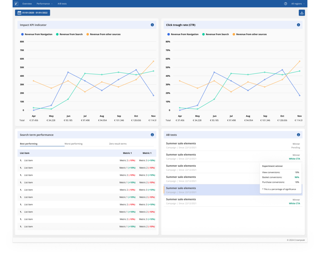
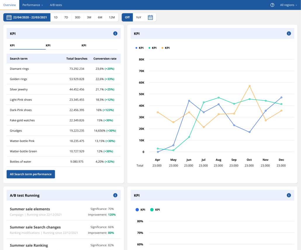
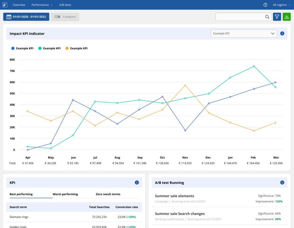
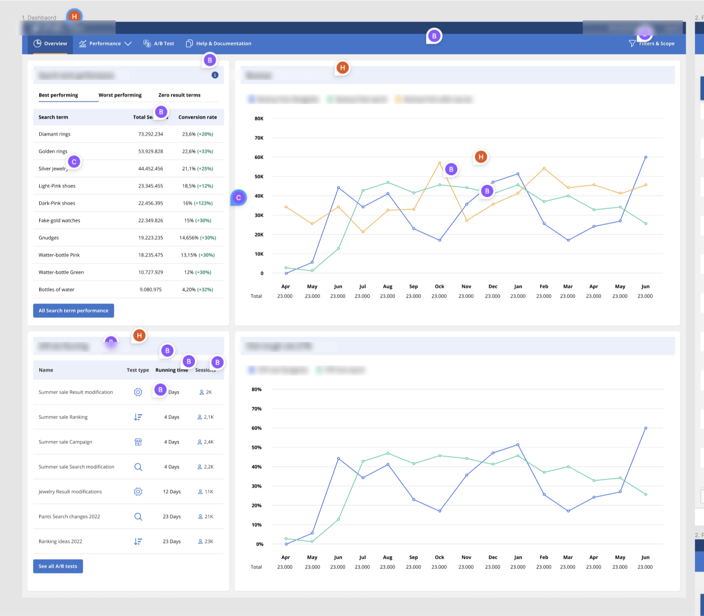
Contextual information
One of the main improvements I wanted to implement on a large scale was providing information within the context of the users experience, to reduce the need for external sources of information like wiki’s.
This was achieved by (among other things) adding detailed tooltips to all metrics involved in tables and list elements. These tooltips aim to provide more context for the user solving two problems at the same time:
1. This creates more context to the users, especially to the ones who are less familiar with working with larger data sets and the terminology.
2. Some of the terms used by the FHR platform are similar to that of platforms like Google Analytics, but the formulas are based on different data points. This resulted in users distrusting the presented data because it was inconsistent with other platforms.
Data deepdives
A completely new feature that we introduced, was data deep dives. In the legacy insights platform users were able to look at relevant data per product or search query and were provided with data in the from of a spreadsheet.
Although we kept this functionality. We’ve added a whole new interaction. Giving the user the ability to generate entire reports on single products, campaigns, search queries and so on.
This feature was designed to be a flexible as possible. Giving the development team the ability to add and change content without a constant need for a designer to add new components.
Which brings me to…
Template based design.
The platform needed to support future expansion. No one can foresee the future but by making the platform ready for new additions makes it easier for the team to add new features without (or with limited) support from a dedicated designer.
By designing pages and modules in a “template” style layout, including rules on alignment and responsive design the platform was as prepared for the future as possible. A few highlights where this was applied:
1. The main dashboard was designed in such a way to support multiple kinds of components, all elements made for this page were designed to work within that layout.
2. The deep-dive module (as seen above) was designed, not unlike a normal page, to fit different kinds of modules. This design also included it’s own ruleset on layout and responsive design.
3. A/B test results (more about this soon) As a new feature, it was relatively easy to implement because it uses the same logic as the deep-dive feature.

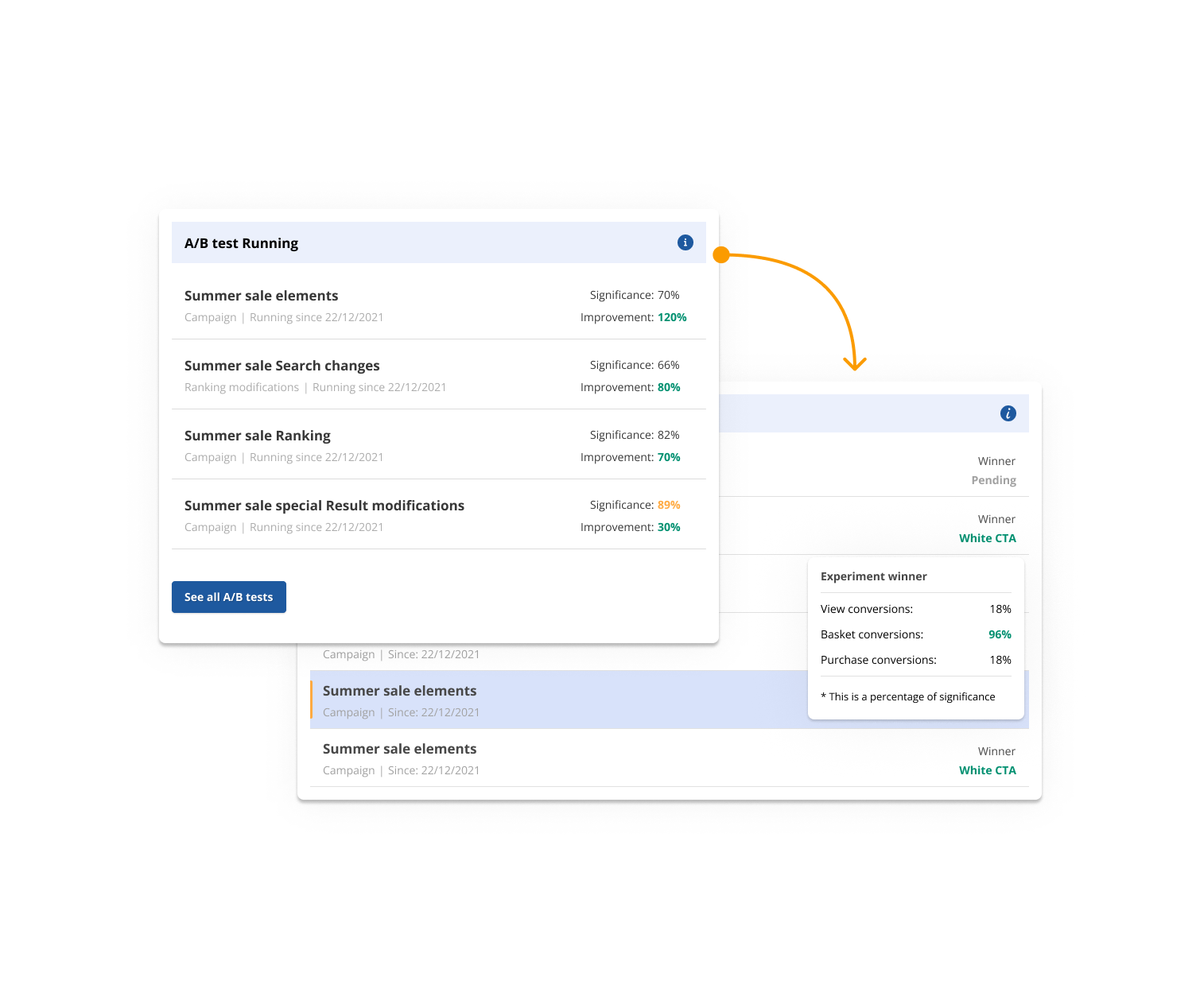
Contextual links
To improve the workflow between the two platforms. Numerous buttons, references and links were placed next to relevant elements. A few examples of this:
- A/B test reports instantly link to the relevant settings within the manager.
- Reports on campaigns link back to their related environment within the manager.
- All the elements on the main dashboard include a (at least one) option to dive deeper into the data, often also offering the possibility to instantly deep-dive into reports such as specific A/B tests or reports on poor/well performing search terms.
- “smart” preview options that show you a preview environment with your current settings applied to it.
This resulted in significant improvements in time it would take the user to perform their basic tasks and gives them a reason to use the platform.
A/B test Redesign
The legacy version of the insights platform had a very rudimentary overview of A/B test experiments available. This feature was also expended upon during the redesign.
Bringing it closed to platforms like Google Optimize, the overview page was expanded by adding more information per experiment, adding the ability to compare the performances and the addition of filter and sorting options transformed it into a valuable tool to use.
On a structural level we also combined the experiment categories into one page, instead of splitting them in different rapport. The best practice in experiments is to keep the amount of active experiments low, so it would benefit the user more to have all active experiments in one overview. Splitting them up would then still be possible using filter options.
Conclusion
The redesign of the Fredhopper insights tool was a rare project that allowed me to work on both a macro and micro scale. It was a lesson in researching not only the needs of the user, but also validating the needs and expectations of the teams within the organisation.
This project was one of the largest and complex projects I had worked on in my career and allowed me to show (and further develop) my skills in User reseach, User Interface Design, (subtle) Motion Design and Product Design as a whole.
The end result, if you could even call it that knowing that it will be expanded on for years to come, is a redesign that both respects the habits of the original users while also providing new, valuable features that would make the lives of our user just a little easier and attract new ones.
It is a product that is designed with the nature of modern software development in mind and is using modern techniques to fit modern expectations and challenges.