Project Description
QUICK & DIRTY… PROTOTYPING
For this project I was asked to test a new functionality that out software would provide to E-commerce platforms. The problem was that we only provide back-end solutions, but for this research I needed to simulate the full experience to get a better understanding of the user requirements.
This resulted in a fun little project that gave me the freedom to play around with some different styles and the prototyping functionality of Figma. This project it is a great example of how to quickly get a semi-decent product in the hands of your user to get feedback early. The entire design including interaction has been made in less than a week.
Role:
Product Designer/UX Researcher
Tools used:

Client/employer:
Crownpeak

RELAXE… IT’S JUST A DEMO
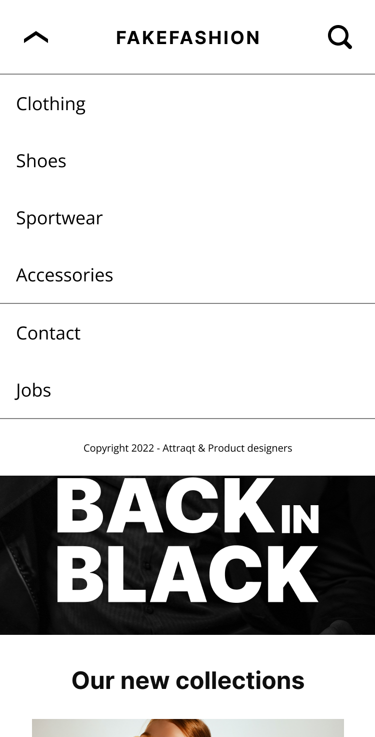
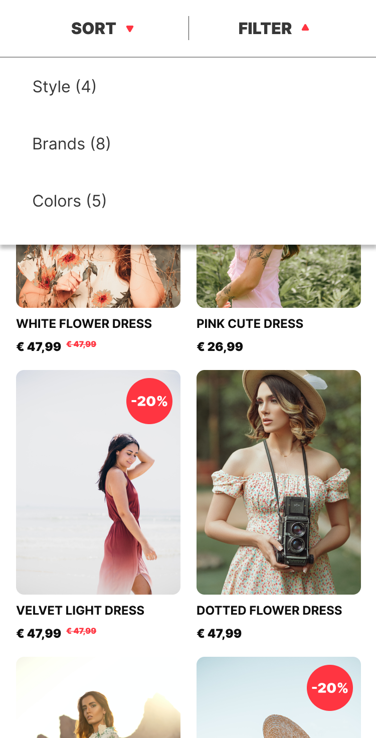
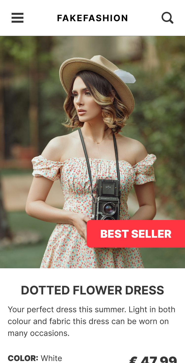
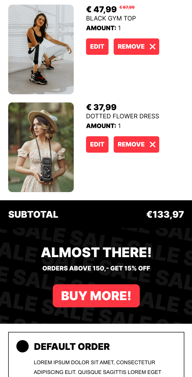
Usually when building a prototype for an in-house project, you are limited to the company style guide. However, for this project I had the freedom to style the prototype however I wanted. And decided to have a little fun with it.
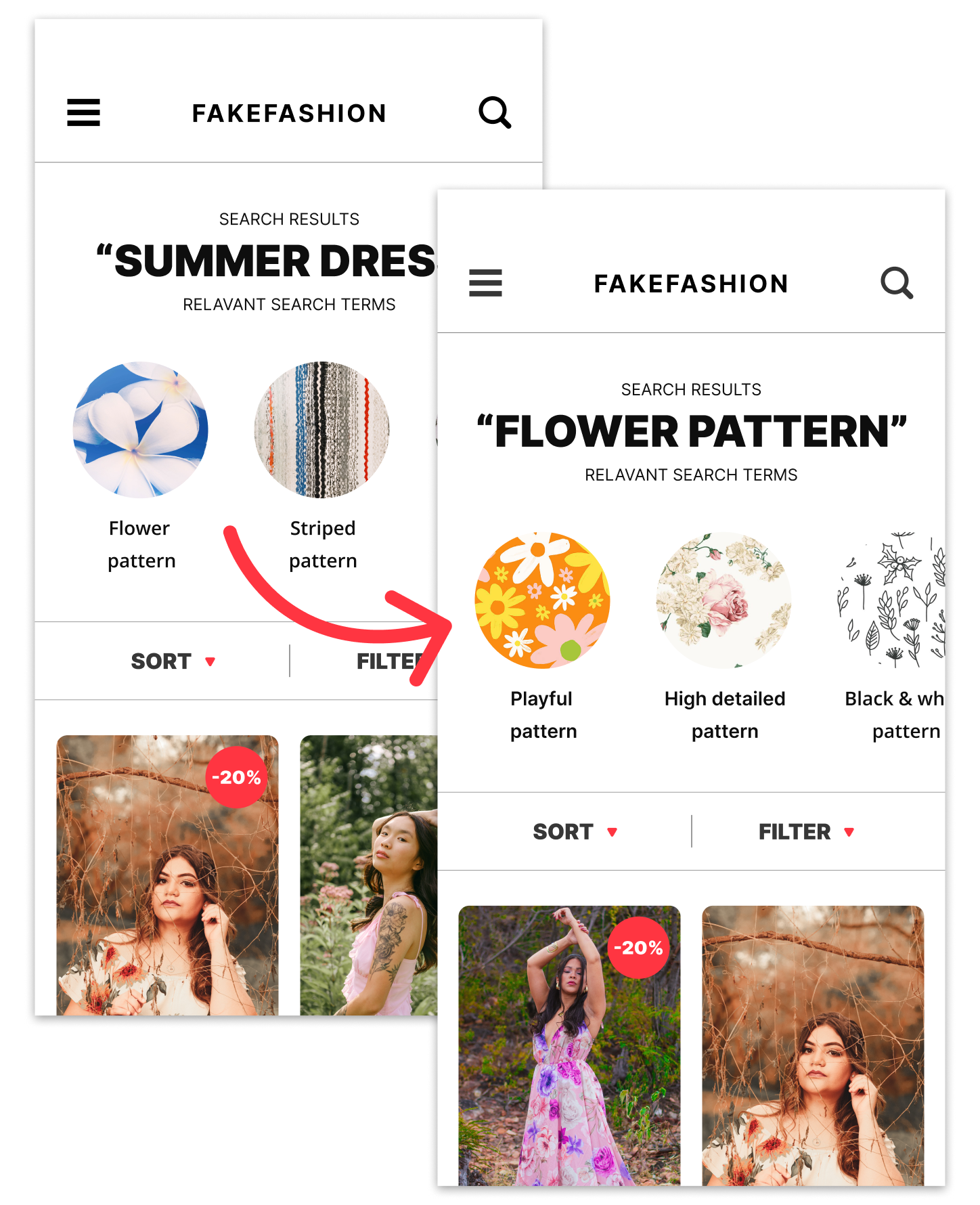
Combining high quality images, and the build-in prototyping feature of Figma I was able to quickly build a design that looked and felt like the real deal.
Next to allowing us to get feedback early in the process, this design also helped with internal communication. Giving us a better idea of what the end result could look like and what technical requirements should be met.
WHAT ABOUT THE RESULTS?
We set-out to get feedback on this rather complex concept fast. Helping us to determine priority by exploring use cases, technical challenges, user requirements and overall interest.
We interviewed about 30 people, 15 of which were stakeholders in the company to align on technical feasibility and 15 were clients to test for general interest and validate requirements.
These were some of our findings:
- There were some technical challenges surrounding the implementation of visual recommendation. This would be hard for a system to predict so it would need a lot of manual input.
- Internally, it aligned with the vision of the stakeholders and improved communication on the project.
- Clients noticed the size of the element was too large and would intrude the customer journey.
- Clients showed a general interest in the feature as long as it was AI driven and low maintenance.
Based on these findings we changed the design to a “tag” system using smaller elements to guide end-users.
*Actual recording of a session with a client.