Project Description
Crownpeak Design Systems
One of my first taks after I became a senior at Crownpeak was to organise the current state of UI design. What software we were using and what policies to implement.
At this moment we just concluded a mayor accusation within the company, essentially doubling the size of the company and it products. To make things worse, almost every product under our roof was made in different software.
Challenge
Evaluate the current state of all in-house product. What design tools are being used to maintain them and setup processes to align these.
Solution
Migrate all products, step by step, to once single tool (Figma) and establish company standards for this tool.
Role:
Product Designer
Tools used:



Client/employer:
Crownpeak
Previous experiences
Before I start talking about our journey towards one design system. I should explain to you why I was selected for this task in the first place.
That reason being that I have been working with design systems since the beginning of my UX career. Having build multiple design systems from the ground up, and worked with even more. As an organised person, I enjoy bringing order to design teams, bringing all elements together and setting up rules on how to use these elements.


Taking inventory
One of my first step in any project is what I call “taking inventory” which means I’m talking to everyone involved and try to get a better understanding of the current situation.
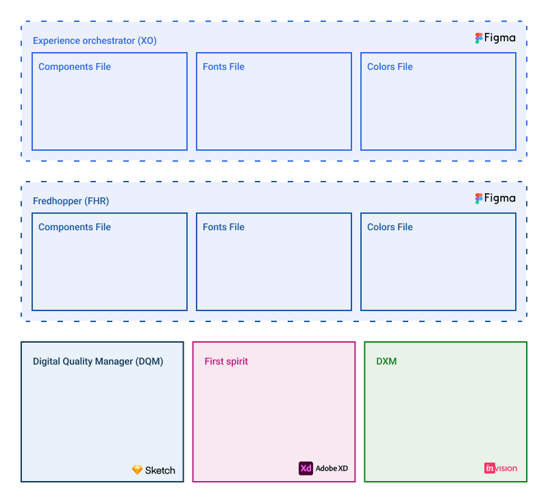
In this case I ended up mapping out our current situation (see image to the right). It turned out that most of our products were maintained rather differently:
- Experience Orchestrator: This product was made in Figma, but consisted out separate files for components, fonts and colors.
- Fredhopper: Because they originated from the same company, this tool war organised in a similar way as XO.
- Digital Quality Manager: This design system was made in one single Sketch file. but needed a separate tool for version control and delivery.
- DXM: This was the least maintained tool and was made in Invision Studio.
The right tool for the job
Building a design system is a complicated task as it is. But for this project we had to make an assessment what software we were currently using before we could decide what tool to use going forward.
In the assessment I looked at different aspects of each tool to decide which one we would use going forward:
- Migration costs of effort
- Supported features & costs
- Collaboration possibilities
- The need for 3rd party tools or plugins
Next to these I also took into consideration industry standards and the probability of that tool still being relevant in the next few years. In the end we decided to go for Figma for its build in component library tool, prototyping and collaboration features.
New structure
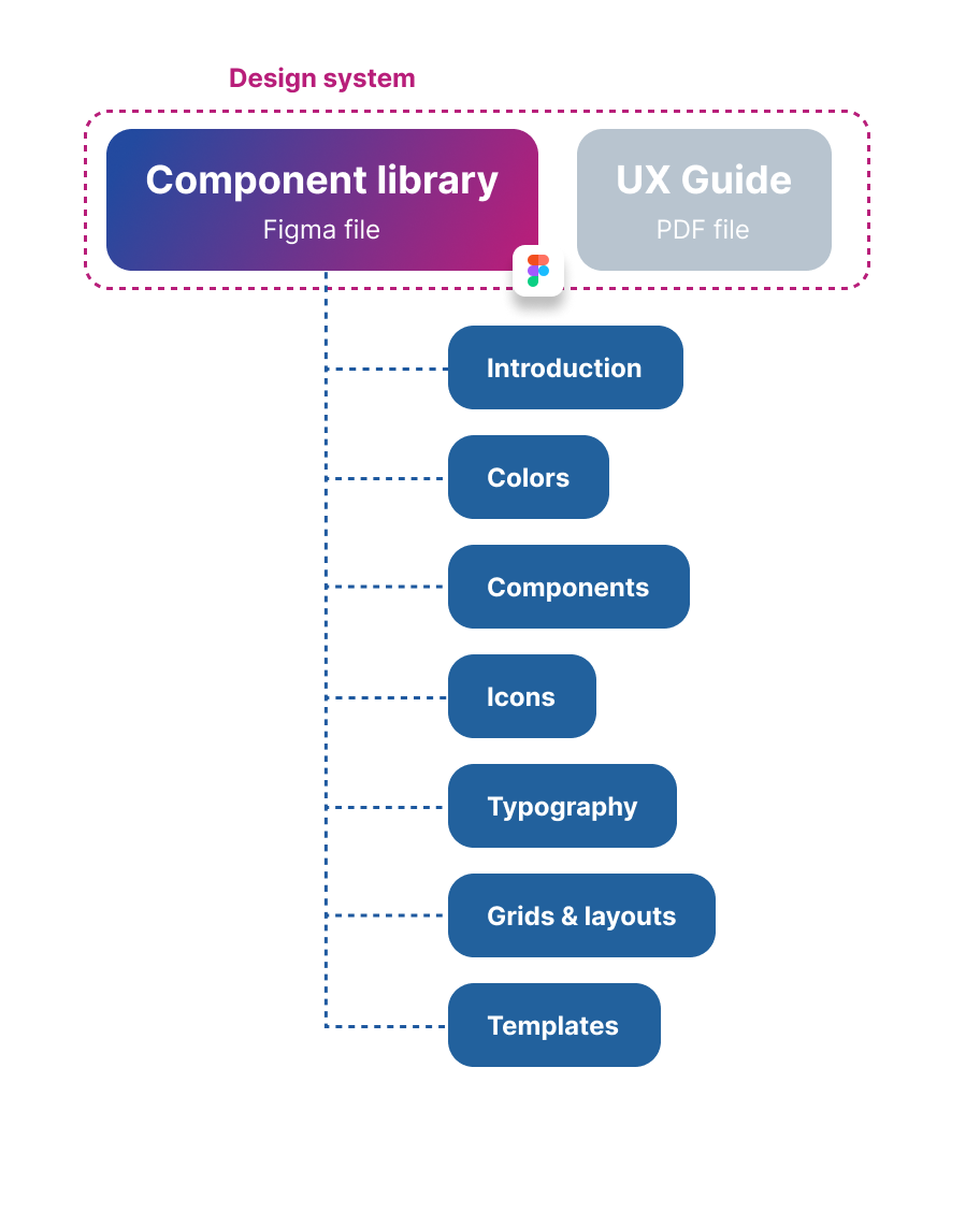
After the decision had been made, I proposed a standardised file structure for each product. We had briefly considered having either 1 big component library or making a “core” file with shared values.
However our products were so different from each-other that these choices made very little sense to us.
Consistency is key
By making al files structured the same way, we significantly improved onboarding times when collaborating with other designers.
It also made things way easier to find.
Atomic Design standards
One of the core principals of these new design systems was the idea of atomic design. A rather well-known principal within the UI design industry, meaning that elements are broken down into smaller components that can be re-used in other components. This is beneficial because:
- Changes within the Design System can be done scalable, quickly applying small changes to multiple components.
- It reduces the amount of repetitive work.
- It significantly improves consistency within the tool because common components all have the same root source.
All our components were build on a 8px grid.

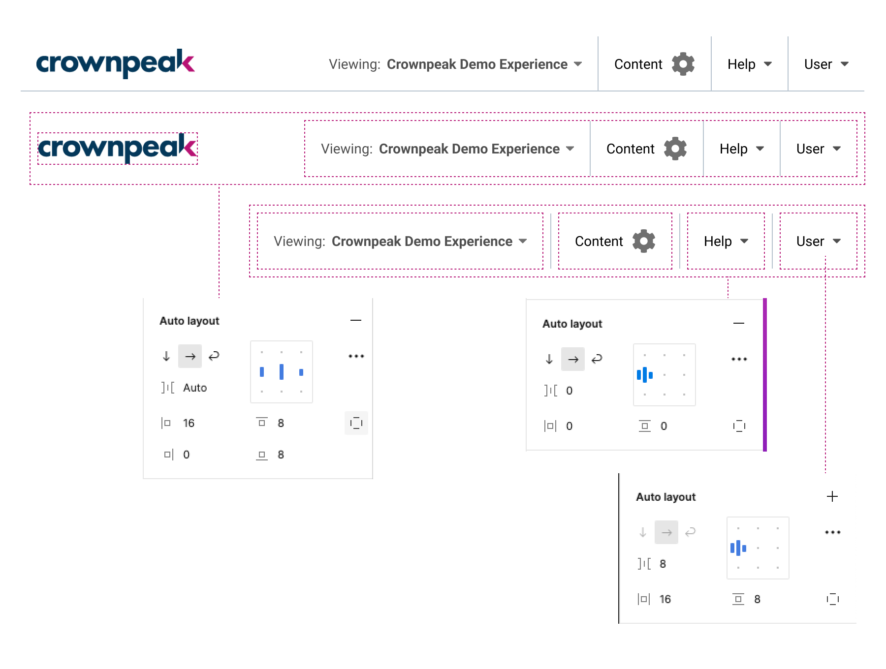
Standardisation on auto-layout usage
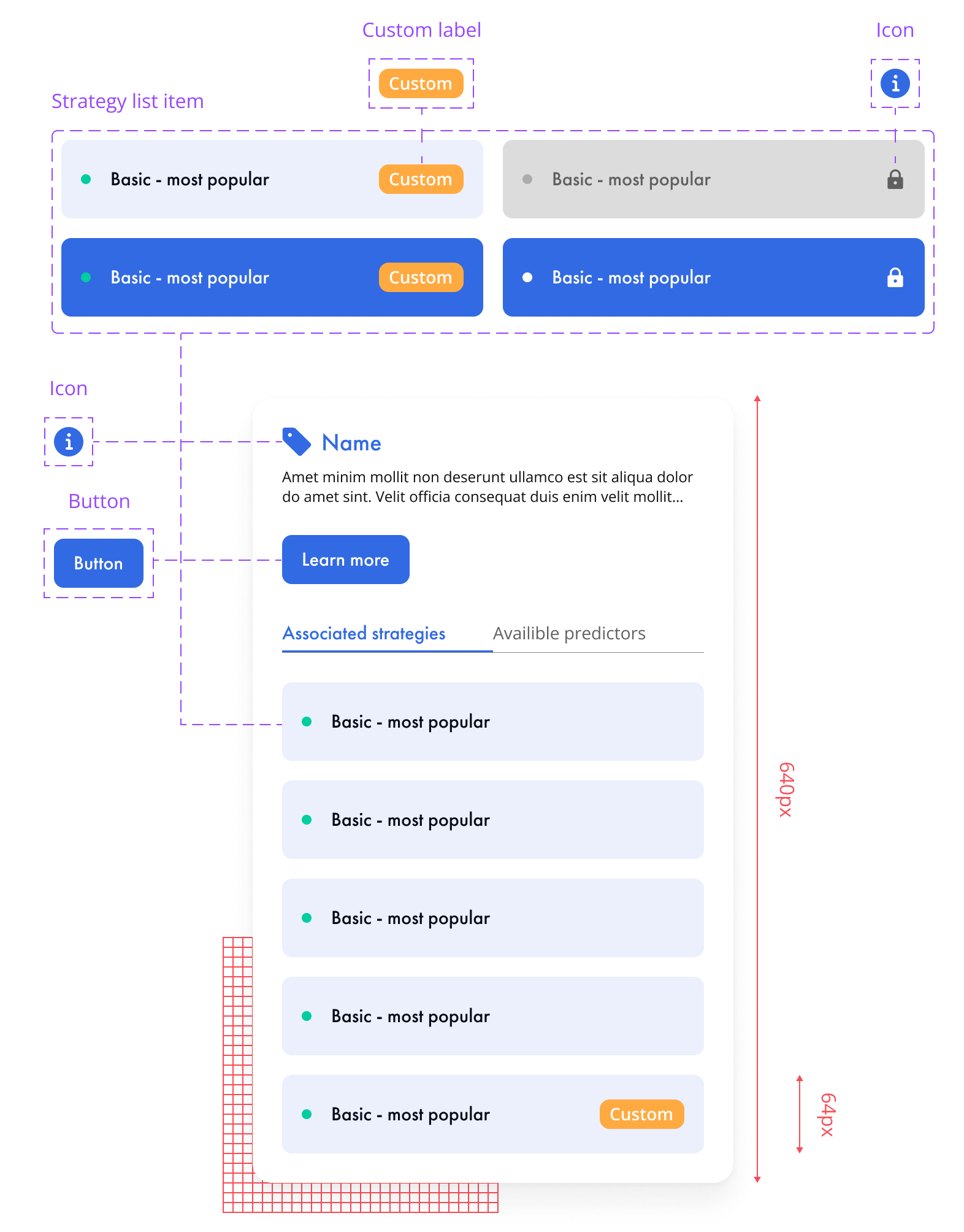
Part of this modular design method was making sure every complex component made use of Figma’s auto-layout feature. This makes components way more flexible in their use.
On the left you can see an example how auto-layout was used in basic components like navigation bars.
The great thing about auto-layout is that it translates really well to HTML and CSS logic, making it easy to deliver to development teams.
Variable values & tokens
One of the newer developments (during this project) was the ability to define variables in Figma files and apply them to component libraries.
The way we implemented these were by splitting values into two groups:
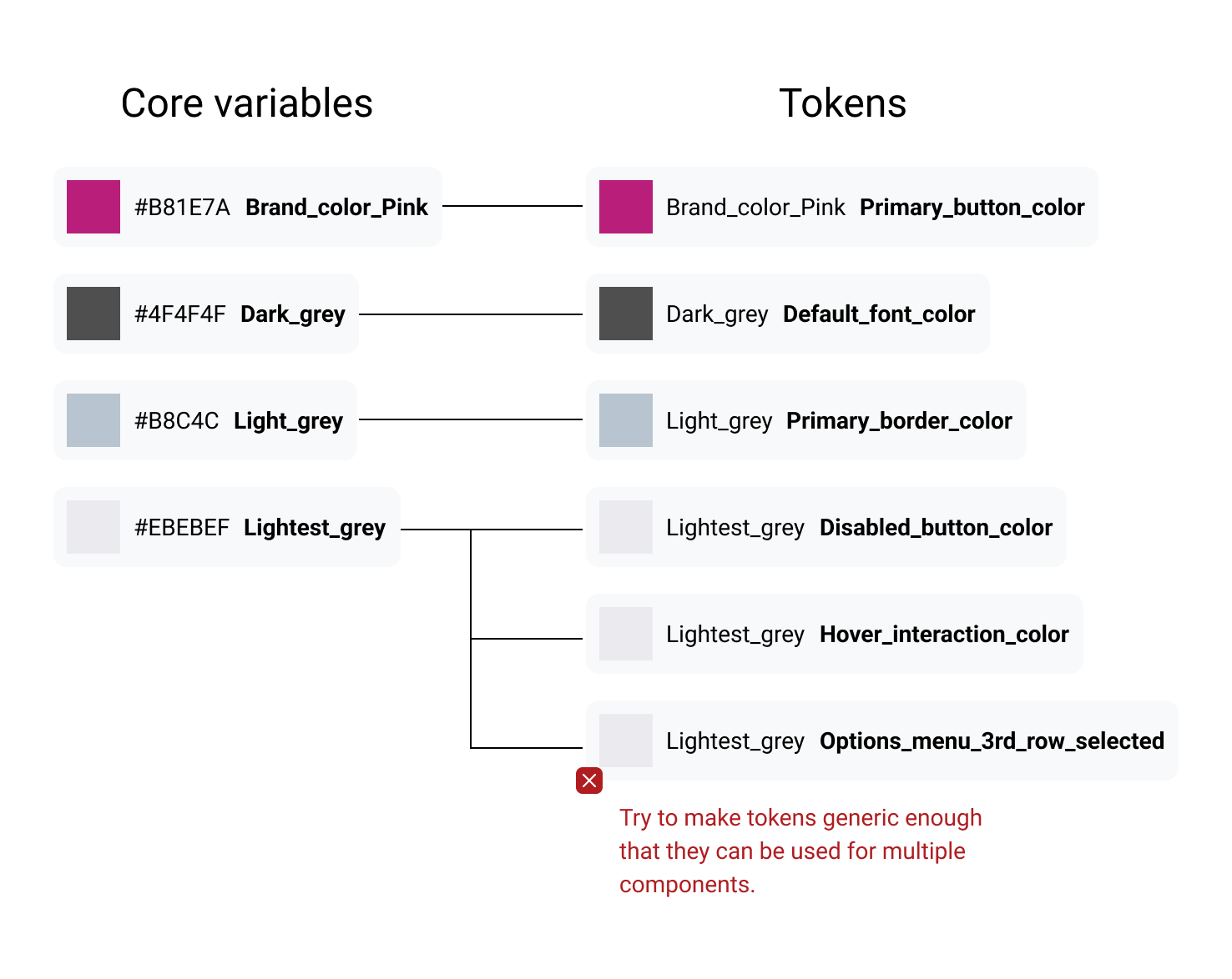
- Core values: These are a small list of well defined colors part of the branding of the product itself. It does not describe how it’s being used.
- Tokens: tokens are specific values that can be applied to components. They are made out of core values and describe how they are being used. (see image to the right).
Because you want to keep your tokens as generic as possible, you will start to use terms like “primary surface color”. This opens up a whole new way of thinking and will help you identify inconsistencies in your designs. “why are we using 3 types of grey?”
