Project Description
Sector
Fin-tech (Financial Technology)
Company
PEAKS
My Role
UX Design/ Product Owner
The initial challenge
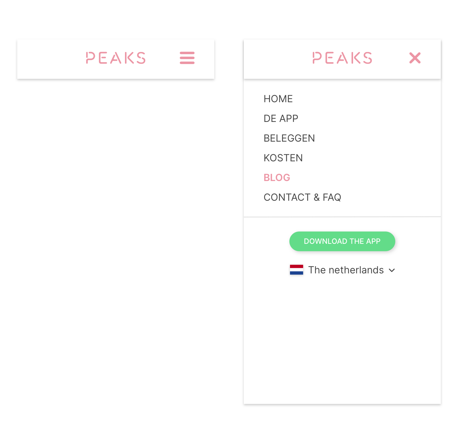
When I was put in charge of the design of the website, we faced multiple challenges. The website was not scalable to accommodate new languages, content management was complicated and a lot of pages were inconsistent. This project focussed on the latter. Inconsistencies were mostly seen in:

Font usage and sizes
There were no clear typography rules, so pages could end up having normal text in 3 different sizes.

50 shades of gray
We used a lot of grey shades in the website. But inconsistently, so you would end up with a lot of different shades.

Element behaviour
Some elements would look exactly the same on one device, and then change in behaviour on another, making maintenance difficult.
Looking for a solution
It was pretty clear that we needed a design system. But my team had very little experience with setting one up. This meant we needed to do some research.
Desk research
To get started, I did some research on the internet to see how other companies make and manage their design systems by looking at presentations and reading articles and Blogs. The most notable insights of this were:
- Atomic Design
- How to make designs systems in Sketch
- Hoe to manage Design systems in Sketch

Workshop with the teams
A system is used by humans, so to just copy someone else’s system was never going to be an option. I talked to developers, content managers and other UX Designers about their experiences, needs and ideas.

Do some inventory
Next to talking to the people who work with the website, I needed to have a good look at the website itself. How was it set up? And what would fit the product best?
Setting up the structure
I used these findings to setup the foundation that would later become our design system
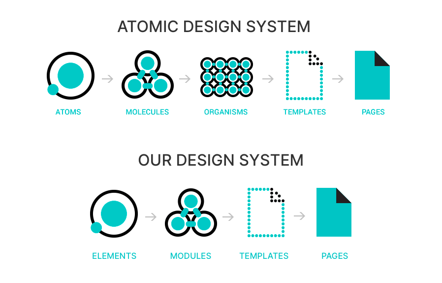
A simpler system, for a simpler product
The website we were working on, did not have an account system, payments system or anything of the sorts. So it didn’t need a very complex and layerd system. So we merged two steps of the atomic design system together and changed the jargon to fit the teams experience.
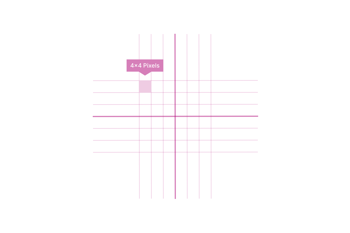
Working on a 4px grid
The entire system is build on a 4px grid system. This means that all the values of the sizes and margins can be divided by 4 and on higher numbers by 8. This means you’re usually using sizes like: 16px, 24px, 32px, 64px.
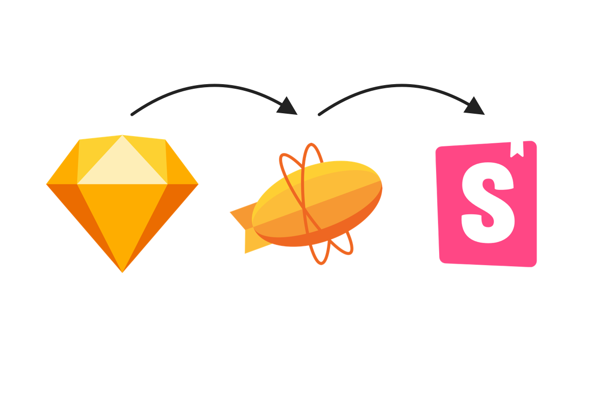
Setting up a workflow
Together with the development team, we came up with a workflow for quality assurance. The order of development would be:
- It is designed in Sketch by A UX designer.
- It is then exported to Zeplin to share the design specs with the development team
- A developer then creates the module in Storybook.
- After that it will be added to the live product.
In each step there is a feedback moment and alignment.
The result
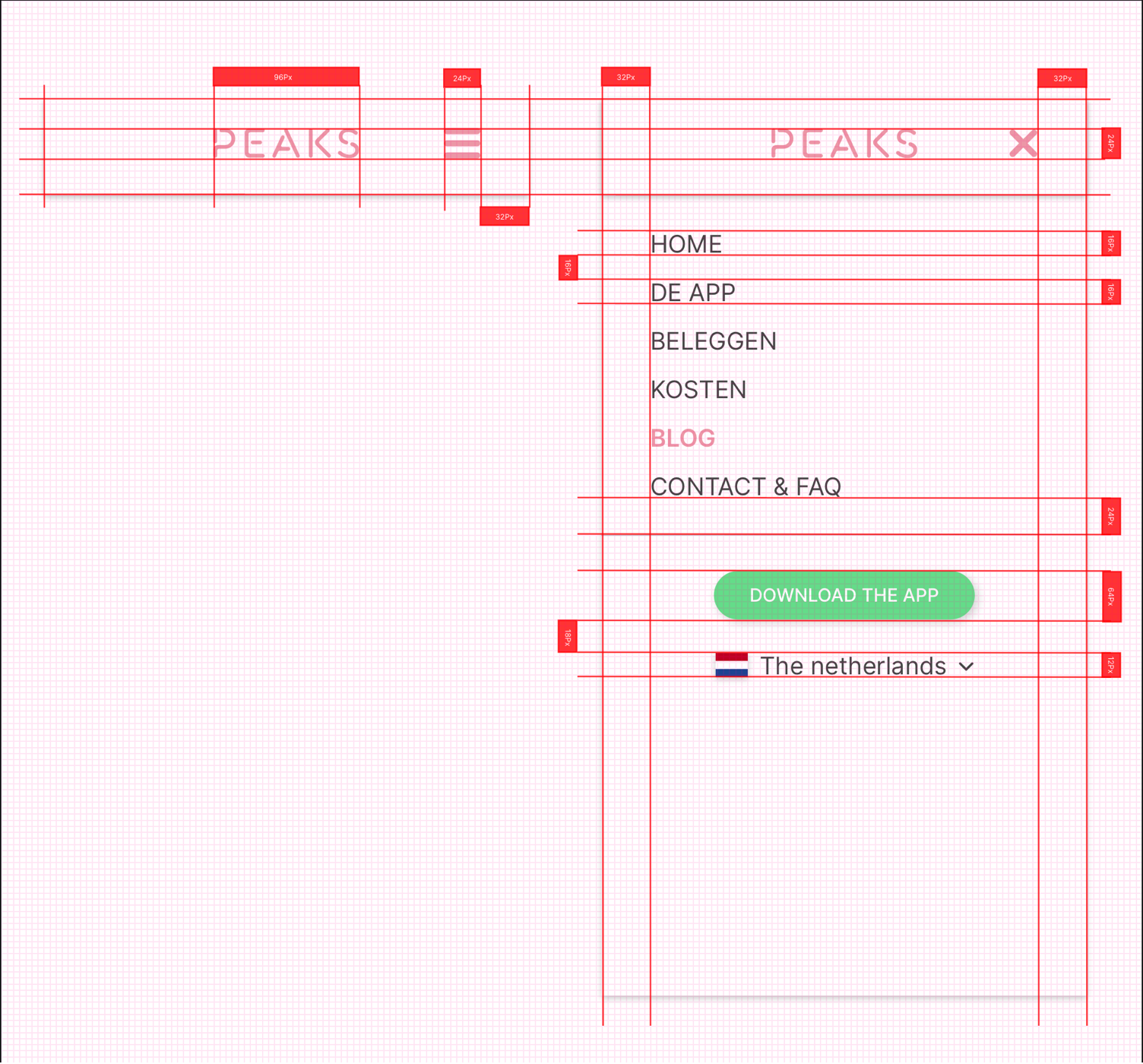
The result of this project was a pixel-perfect UI library. By using a 4×4 pixel grid (see the image above) we were able to ensure designs looked consistent, and ordered. The ‘jumps” in sizes used in margins also made it easier for a designer. No longer should lie awake at night wondering if your margins should be 16px or 17px. By making jumps of 4px and 8px decisions are made faster and the design remains consistent.
After implementing the system we noticed a jump in overall quality and consistency. We become more focussed on delivering products pixel-perfect. And the feedback from development reflected this as well.